Build products faster with a design system
A design system is your blueprint for fast, consistent, cohesive design and development workflow.
What do all the best apps have in common?
Great apps have a cohesive design language AKA a design system!
As the app scales, and the team grows, everyone has a clear set of principles and design guidelines to refer to.
New designers added to the team have fewer questions, and can create better experiences quickly and efficiently — with fewer revisions.
What's a design system?
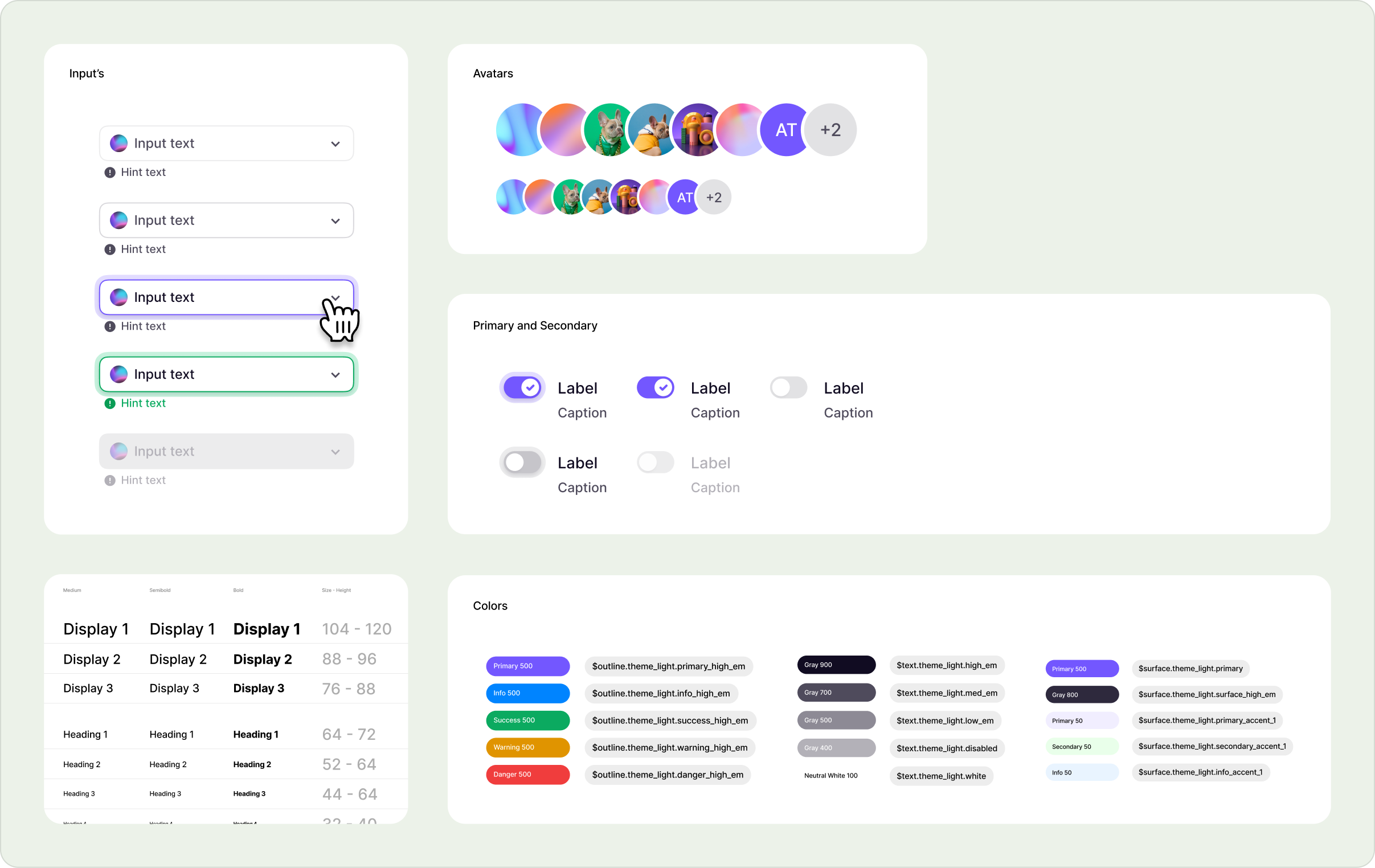
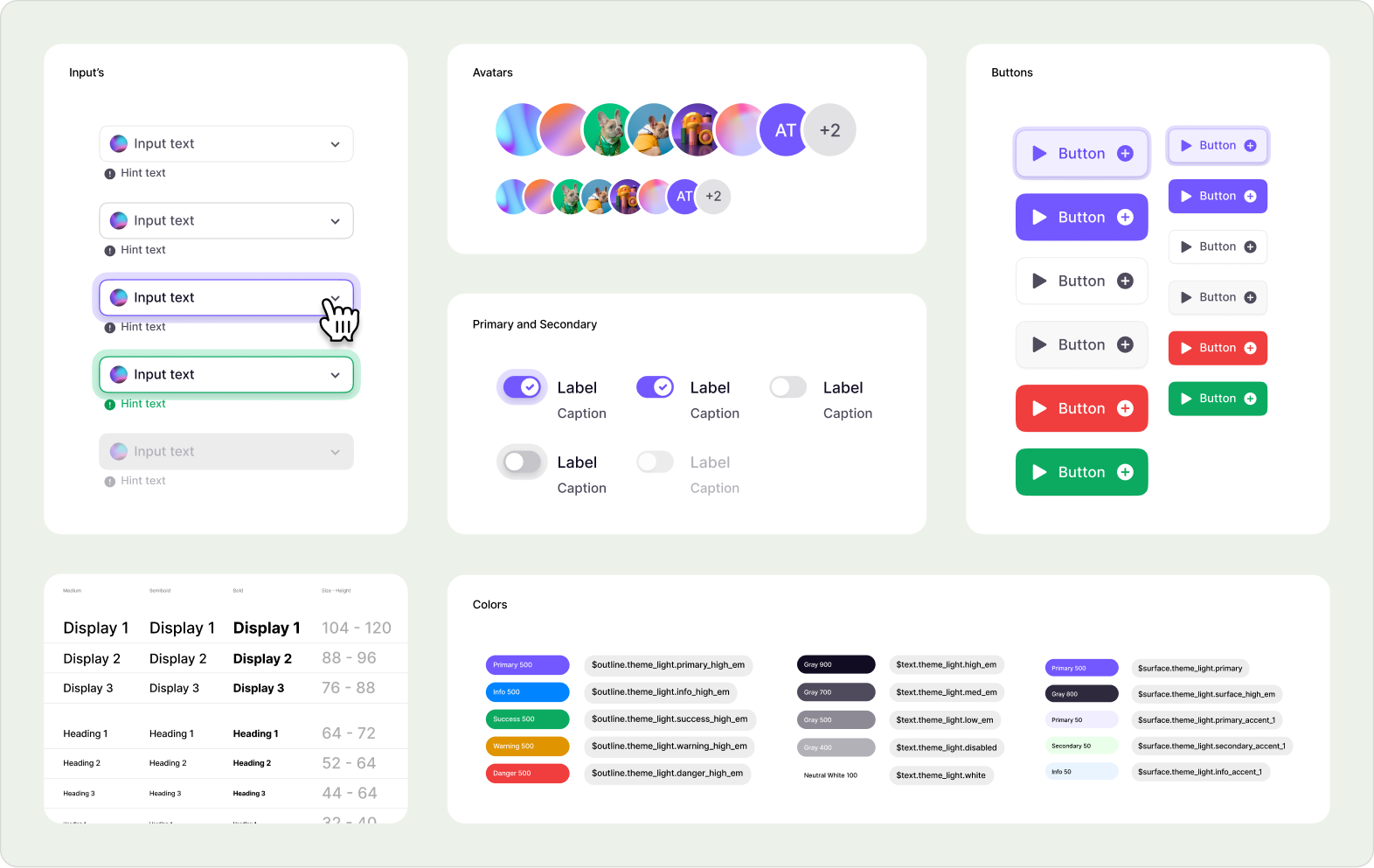
A clearly defined set of design patterns, principles, and guidelines that help you scale your app or product ecosystem. It's more than just a list of ui components.
It's a shared language and single source of truth for your team's work.
Aren't design systems tools for just designers?
No Way! An effective design system involves many teams so everyone is on the same page, speaking the same language.
- If you know how you treat multi-step processes, you don't have to rethink that every time.
- If you know how you organize modal action decision points, it's already set and everyone is on the same page!
Along with keeping your existing features visually consistent, a good design system shapes the look and feel of future features — so you end up with a product that feels professional, and your work is focused on shipping features faster.
Design systems provide an answer key to future product design problems.
It becomes the single source of truth for designers, developers, and product.
Can design systems actually provide tangible ROI?
They can! Listen to Brian Colby describe how the design system helped the Moen team in a short amount of time.

"We stood up a fully functioning design system in a couple of months...We could not have done that as quickly without UX Cabin, so incredible ROI on that"

Brian Colby
Principle UX Design, Moen
👍
With a design system
Your team saves time, energy, and aggravation by having all the elements and code snippets at their fingertips
🛫 Faster feature development
Building new features goes much more quickly when the rules for "How this should work and look" and code components are already laid out. Plus, each component you create automatically answers future questions about how to use or include that component.
📄 Detailed Documentation with instant buy-in
Because each component library comes with detailed usage guidelines, team members can have fewer conversations around visual elements, and more useful conversations about users, and the product.
💋 Built-in cohesiveness
Having a pattern library of visual references that designers and developers can easily access will help all your features leverage existing building blocks.
🔨 Simple maintenance
Imagine updating a component in one place and it replicating to every instance, everywhere in your app. Amazing! That's the way to manage design. Why haven't you been doing it this way all along?
👎
Without a design system
You build an ugly, confusing app that no one enjoys working on because no one has reusable components and you have to rethink everything for each feature
🐢 Slow feature development
Without a design system, your design resources have to answer the same questions over and over again before even beginning to build. (And the answers will be visibly different every time.)
🗣️ Design team disagreement
Designers and developers often burn time on problems already solved. This wastes other product team members' time, yields uneven results, and takes your team away from solving new and more interesting problems.
😵 Disjointed elements
Over time, your application can drift out of sync with itself. The design efforts might start to feel unpolished or even untrustworthy. Pieces of your app might not even look or operate like they're part of the same system.
😡 Maddening maintenance
When a "simple" task like changing an interface element requires refactoring multiple instances of the same component across an entire app, it's not so simple anymore.
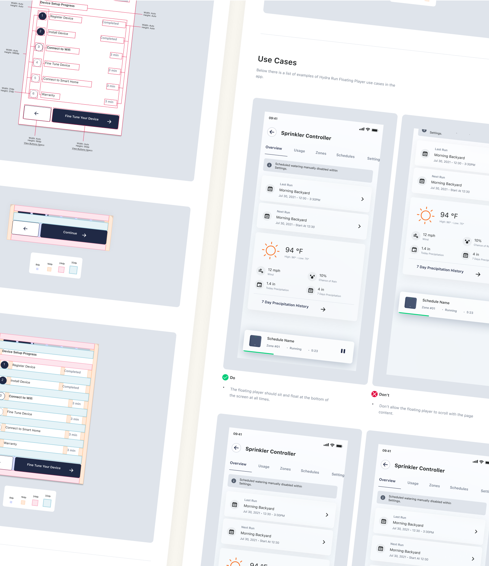
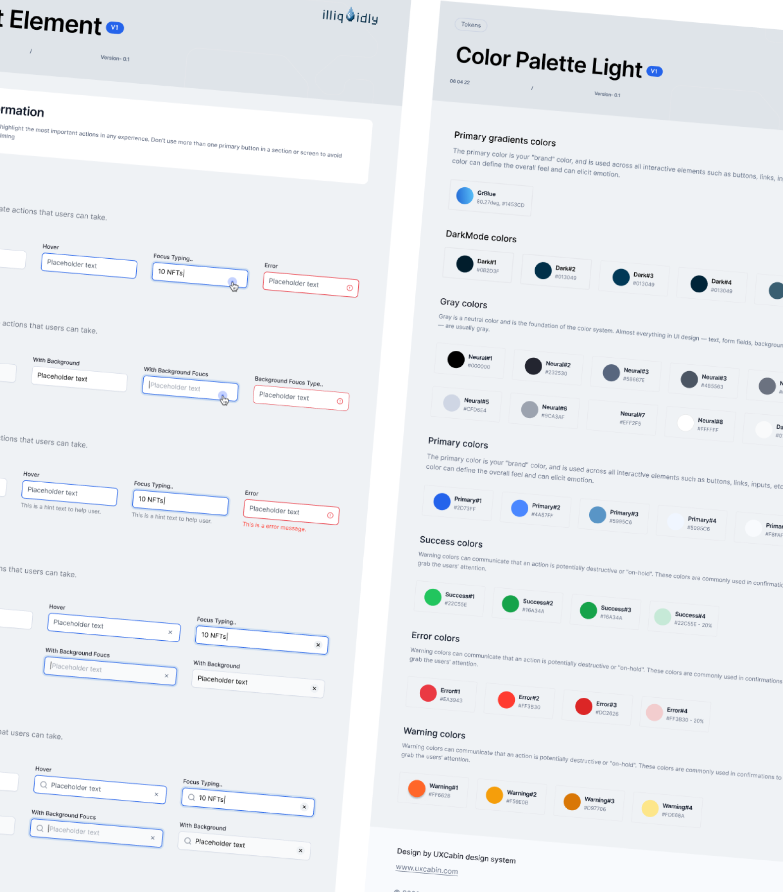
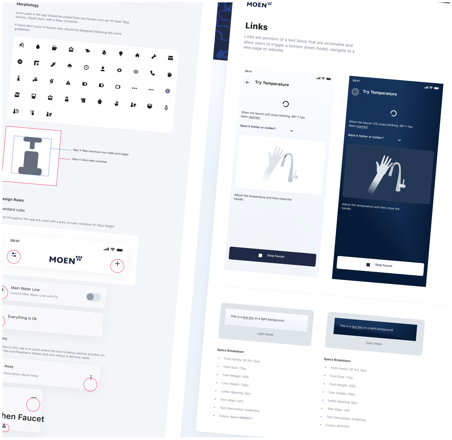
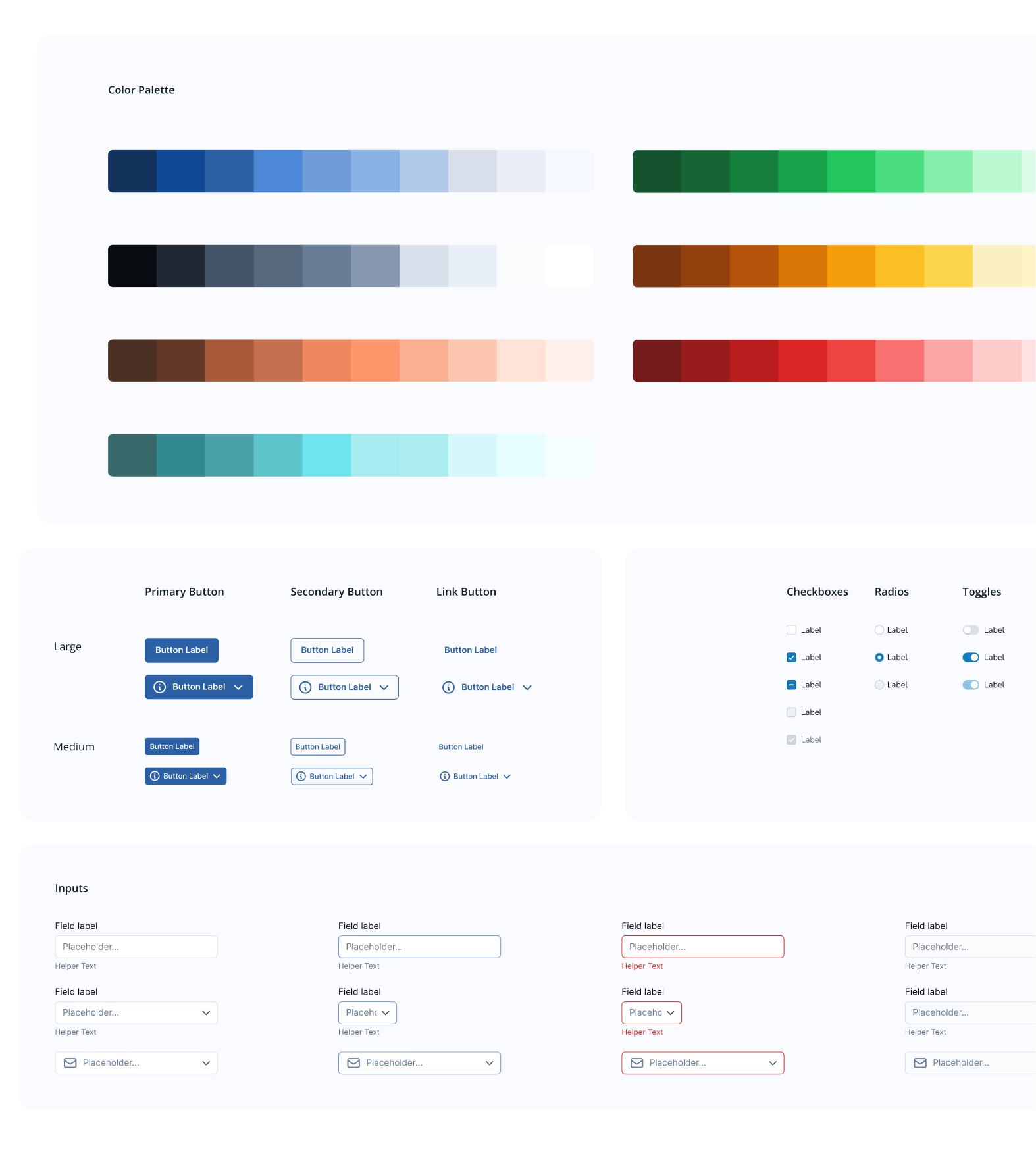
This all sounds great... but can you show us some of your design system examples?
I thought you'd never ask!
Great! What's the process?
At UX Cabin, we work according to the Atomic Design Principles.
The basic idea is that if you build the foundational (AKA atomic) elements correctly, then it becomes simpler, faster, and easier to scale to more complex elements, pages, templates and ultimately products.
Week 1 Product Inventory
We'll review your entire product and the design components you currently have. We'll get a baseline for your particular needs and create a simple plan of attack.
Week 2 Define "Atoms" aka design tokens
We'll solidify the foundational atomic elements:
Week 4-6 Design Principles Pilot Project
Rather than rebuilding your ENTIRE product, we'll refine it out by building a small subset of work. Maybe it's a new feature, a problematic workflow, or a new page that we can use to build organisms (multiple molecules put together) and build in guidelines for these moving forward.
We do this because we want to build things in the context of your actual product. Each feature we build we learn and refine. Rather than building out a massive system without learning from incremental improvements.
Ongoing: Scale and Iterate
We'll use our new designs to create simple and effective features to support your teams work. Each new feature gets directed, documented, and built into the design system. The more we build, the faster it becomes to scale our new designs.
The end result?
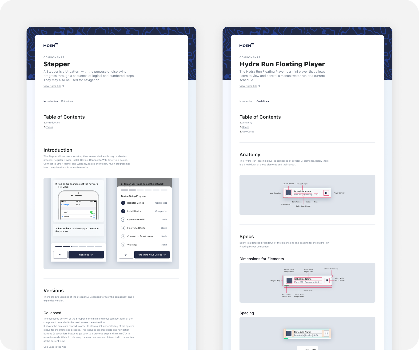
An easy-to-reference, pixel-perfect system of reusable UI elements in Figma, using best practices, including auto-layout, reusable components, variants, color styles, and typography styles.
Everything you need to kickstart your very own design systems team.
FAQ
A design system is an indepth library of elements, components, templates on how they all work together. These rules and guidelines help govern the design process so you can build products faster and more efficiently.
Styleguides show basic visual aspect for font and color usage for a given brand identity.
A pattern library is a subset of a design system that focuses on visual design elements rather than a comprehensive set of guidelines, principles and component libraries.
Maybe you have a blog or an informational website. You probably need something more like a style guide than a design system. We can help with that too! It's just not as involved as a design system.
- Material design (MUI for react)
- Bootstrap
- Tailwind
- Blueprint UI
Send us a message or schedule a call and we'll grab a time to review your current product and give you our recommendation on how we can help!