Case Study
Cellulacrum Cancer Community Platform Landing Page
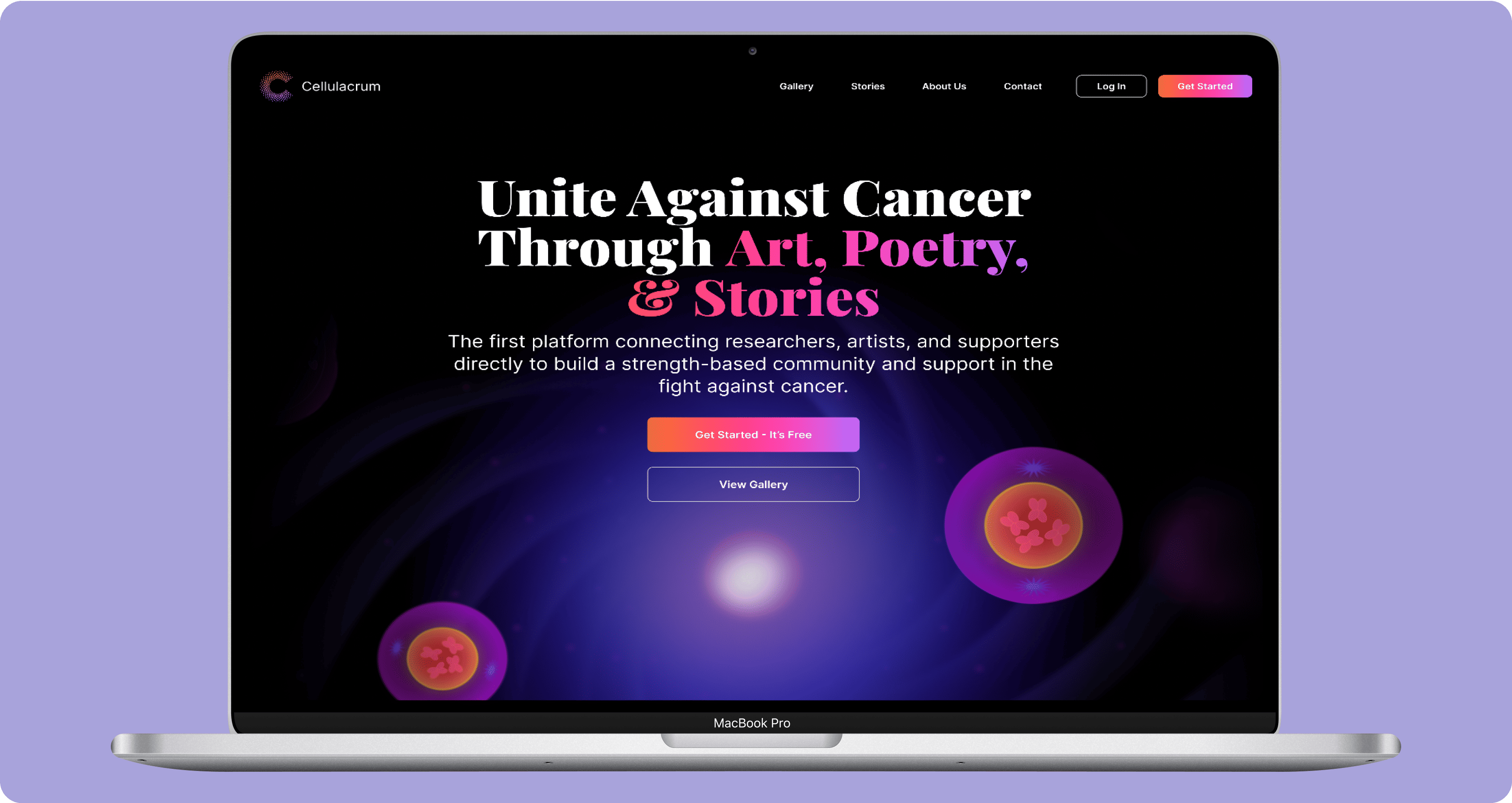
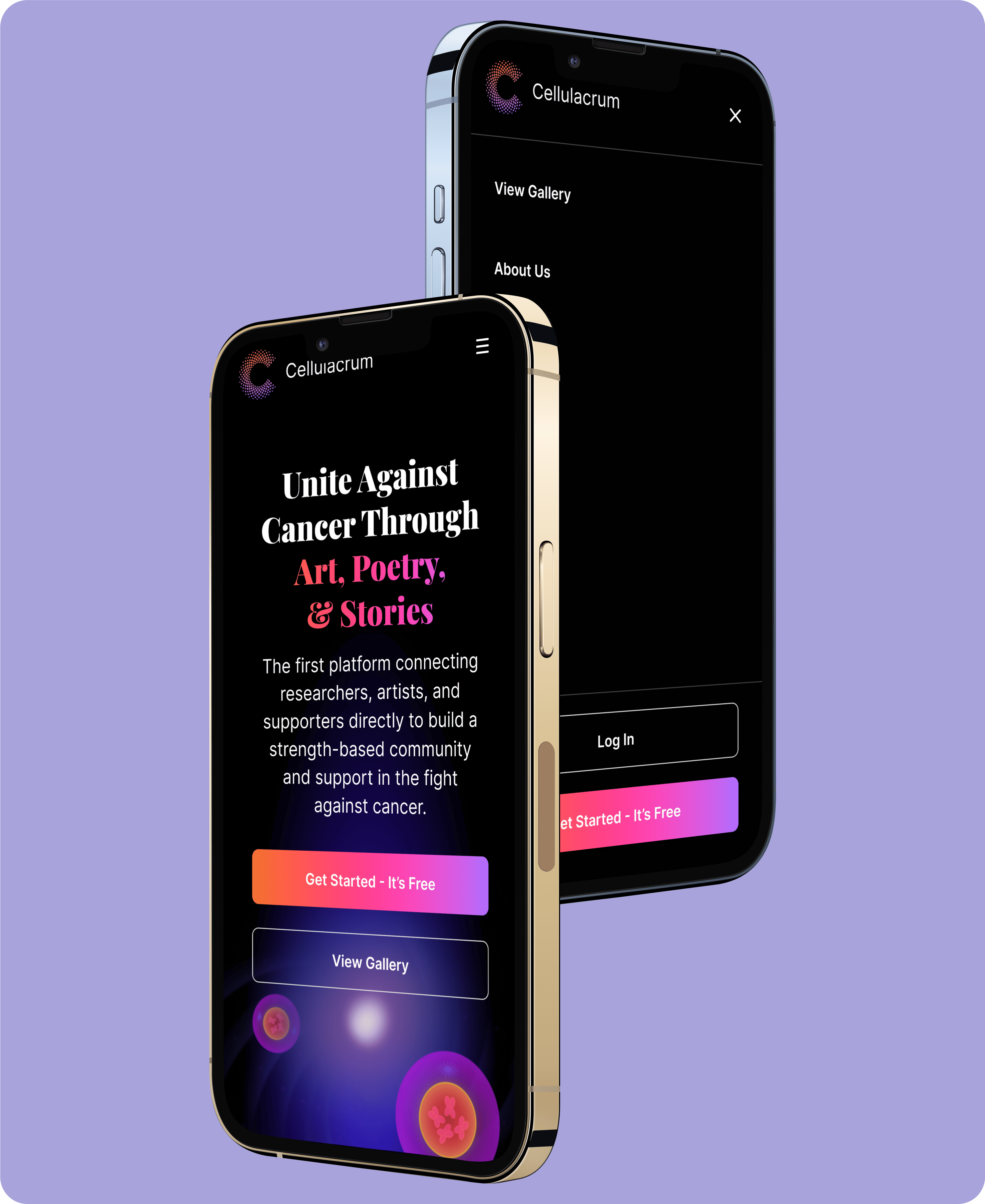
UX Cabin designed and built a landing page for the first platform that connects researchers, artists, and supporters to create a supportive, strength-based community in the fight against cancer.
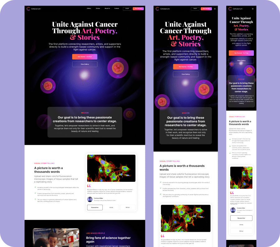
💻 Landing Page Design
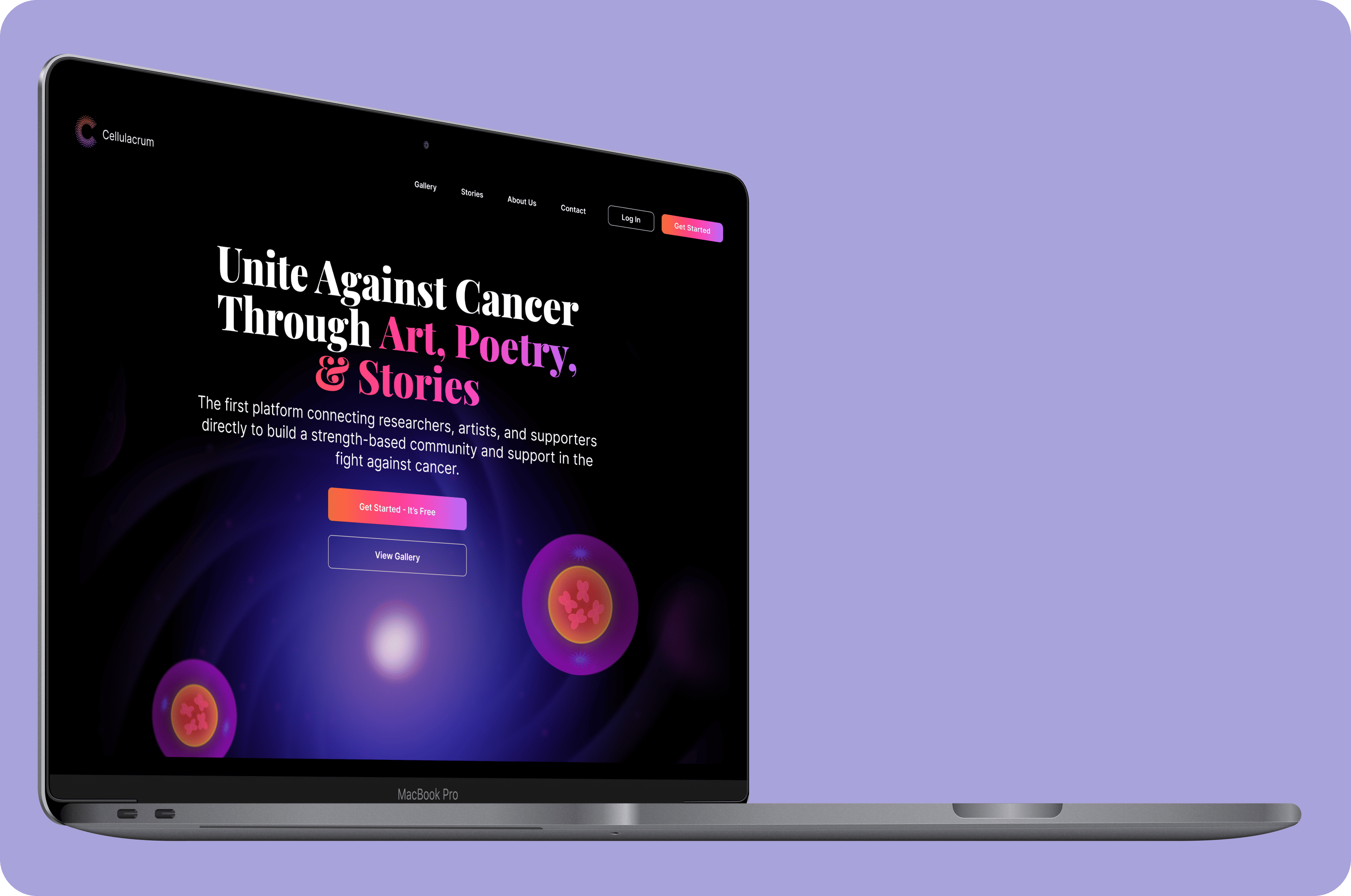
Cellulacrum aimed for a clear landing page that showcases their features and brand well.
♾ Logo Design
UX Cabin collaborated closely with the brand to understand its values, mission, and audience, creating the Cellulacrum logo.
🤝 Developer Handoff
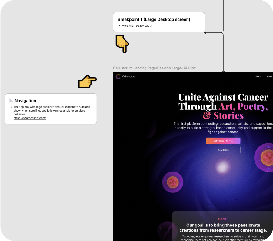
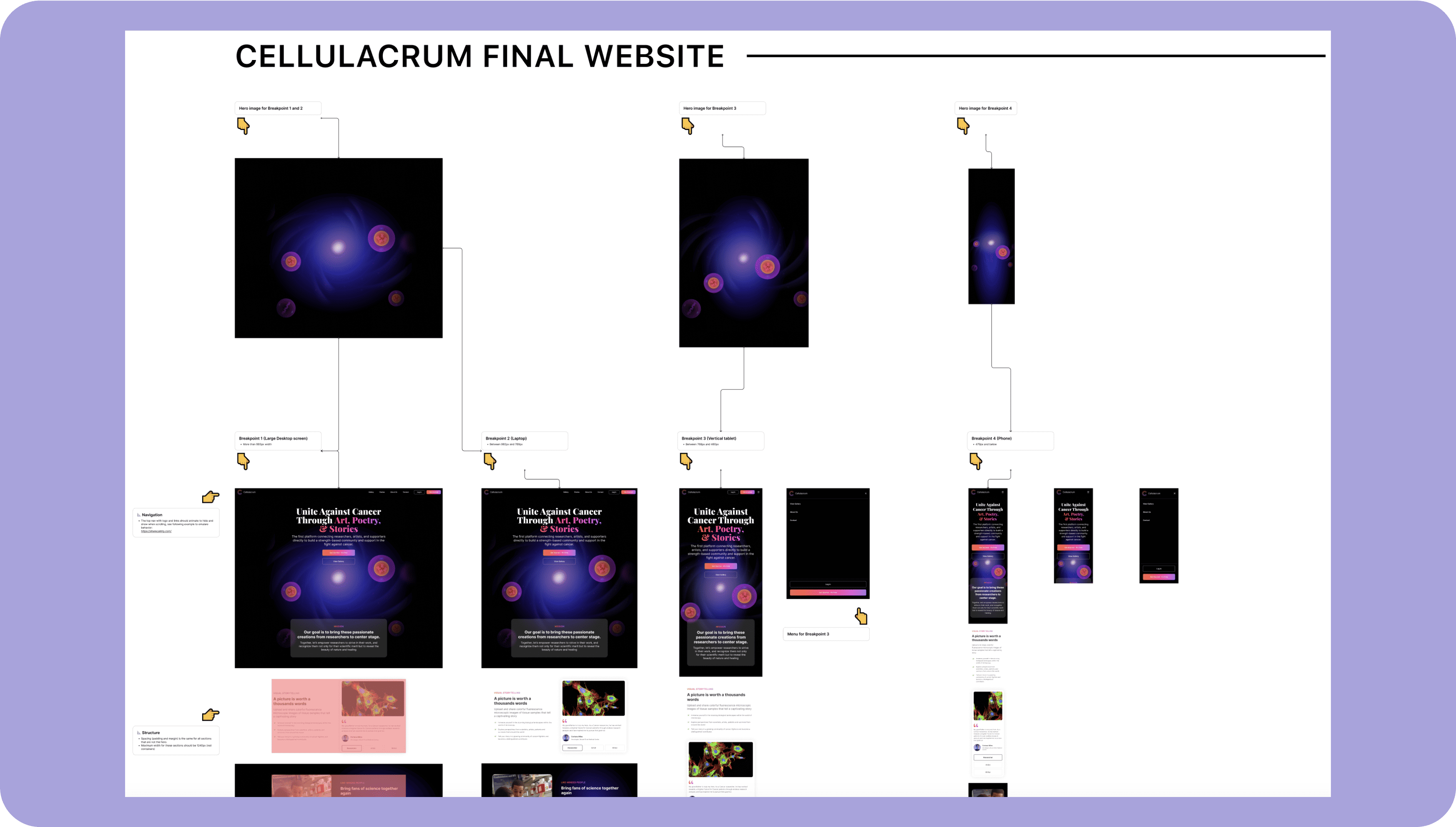
Provided the developer with annotated designs and specs for a smooth handoff, ensuring UI elements are implemented seamlessly.
Overview
Cellulacrum is a specialized software platform aimed at connecting biology researchers and enthusiasts, as well as individuals with personal connections to cancer.
Background
Fran Nederlof from Qi Biotech collaborated with UX Cabin to create a social media platform connecting researchers with biology lovers, art enthusiasts, and cancer survivors, starting with a landing page to gauge interest before launching an interactive app featuring sequencer videos and captions that share biological stories and personal experiences.
“Working with UX Cabin was fantastic; they turned our ideas into a landing page that beautifully blends art and science.”

Fran Nederlof
Founder, Cellulacrum
Goals & Objectives
- Design an engaging landing page to introduce Cellulacrum’s platform and captivate visitors’ attention immediately.
- Showcase Cellulacrum’s core features—digital gallery, storytelling captions, and user-generated content—in an accessible, visually compelling format.
- Drive sign-ups by clearly communicating the app’s purpose and value, aiming to connect with biology enthusiasts, art lovers, and individuals with personal ties to cancer.
Design Process
UX Cabin worked with the Qi Tissue team to identify key needs and challenges, creating wireframes and high-fidelity mockups with a clean, modern design. The iterative process led to a visually appealing landing page, ready for developer handoff.
Branding Questionnaire & Logo Explorations
To establish Cellulacrum’s visual identity, we refined Cellulacrum’s brand values and visual identity through a branding questionnaire and logo exploration, creating a design that merges science, art, and storytelling.

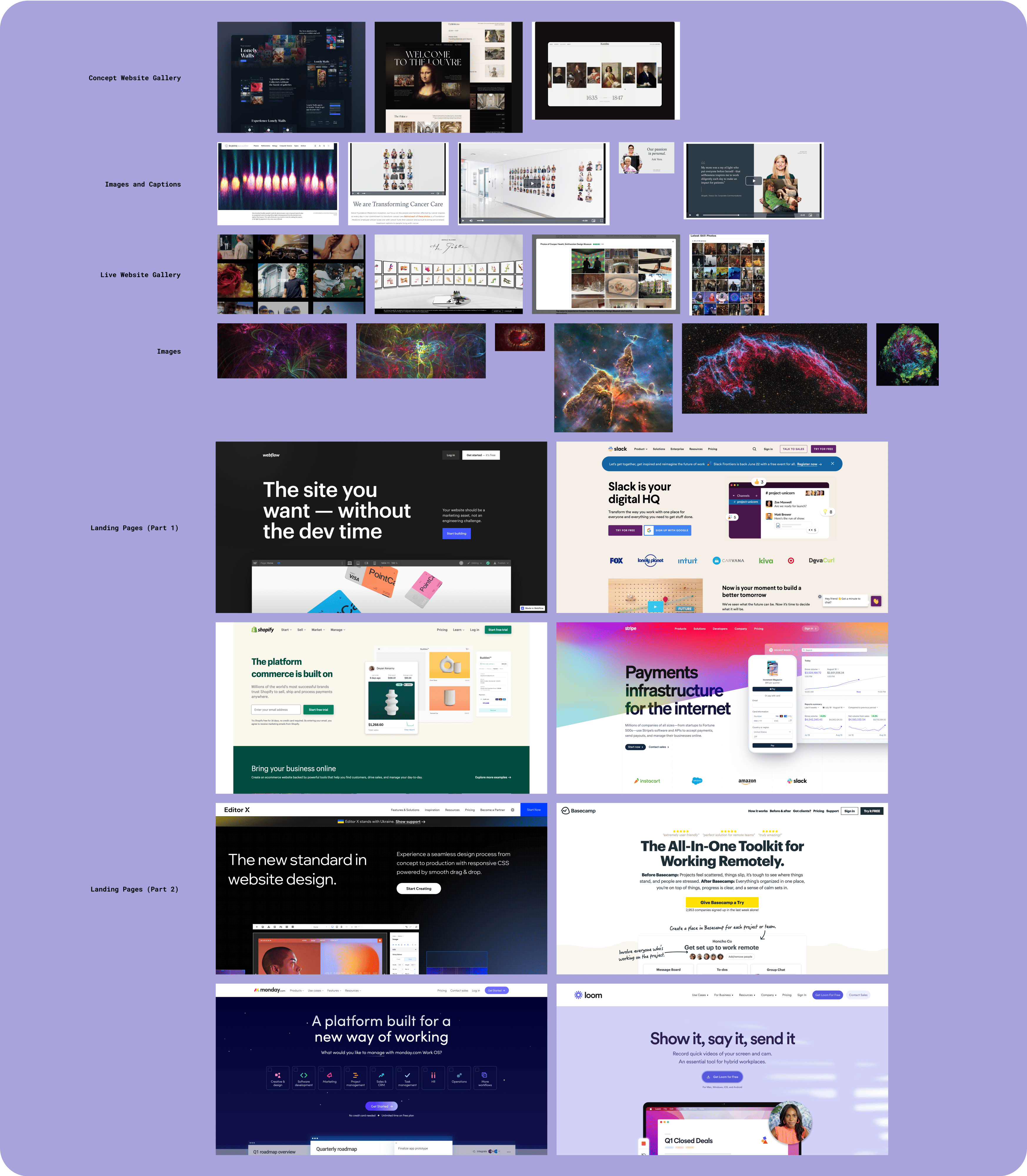
Moodboard & Competitor Analysis
We began by developing a moodboard that captured the aesthetic Cellulacrum sought to embody, drawing inspiration from leading science and art platforms. A competitor analysis further refined our approach, helping us identify best practices for user engagement and effective storytelling on landing pages.
Wireframe Iterations
Multiple wireframe iterations were crafted to map out the landing page’s structure, focusing on layout clarity, visual hierarchy, and content flow. Each iteration brought us closer to an intuitive design that highlights Cellulacrum’s unique features while guiding users naturally toward sign-ups.

Hi-Fidelity Mockups
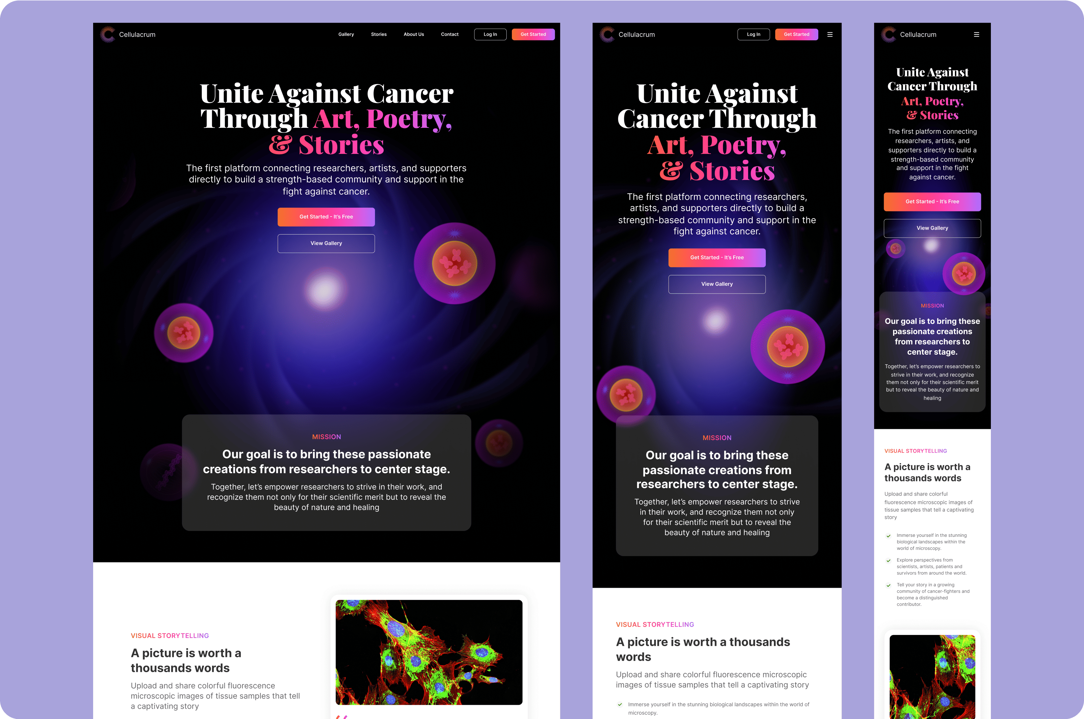
With the structure solidified, we designed high-fidelity mockups that brought the visual elements to life, incorporating branding elements from the moodboard and color schemes that evoke the platform’s scientific and emotional focus.
Design Handoff
Once finalized, the high-fidelity mockups and a detailed style guide were handed off to developers, ensuring that each visual and interactive detail was precisely translated into the live landing page.
Results
The landing page design was a success reflecting the brand and storytelling-focused design.