Case Study
Changed Debt Repayment App
UX Cabin helped Changed design it's new changed premium features and improve revenue by 120%
120% Increased Revenue
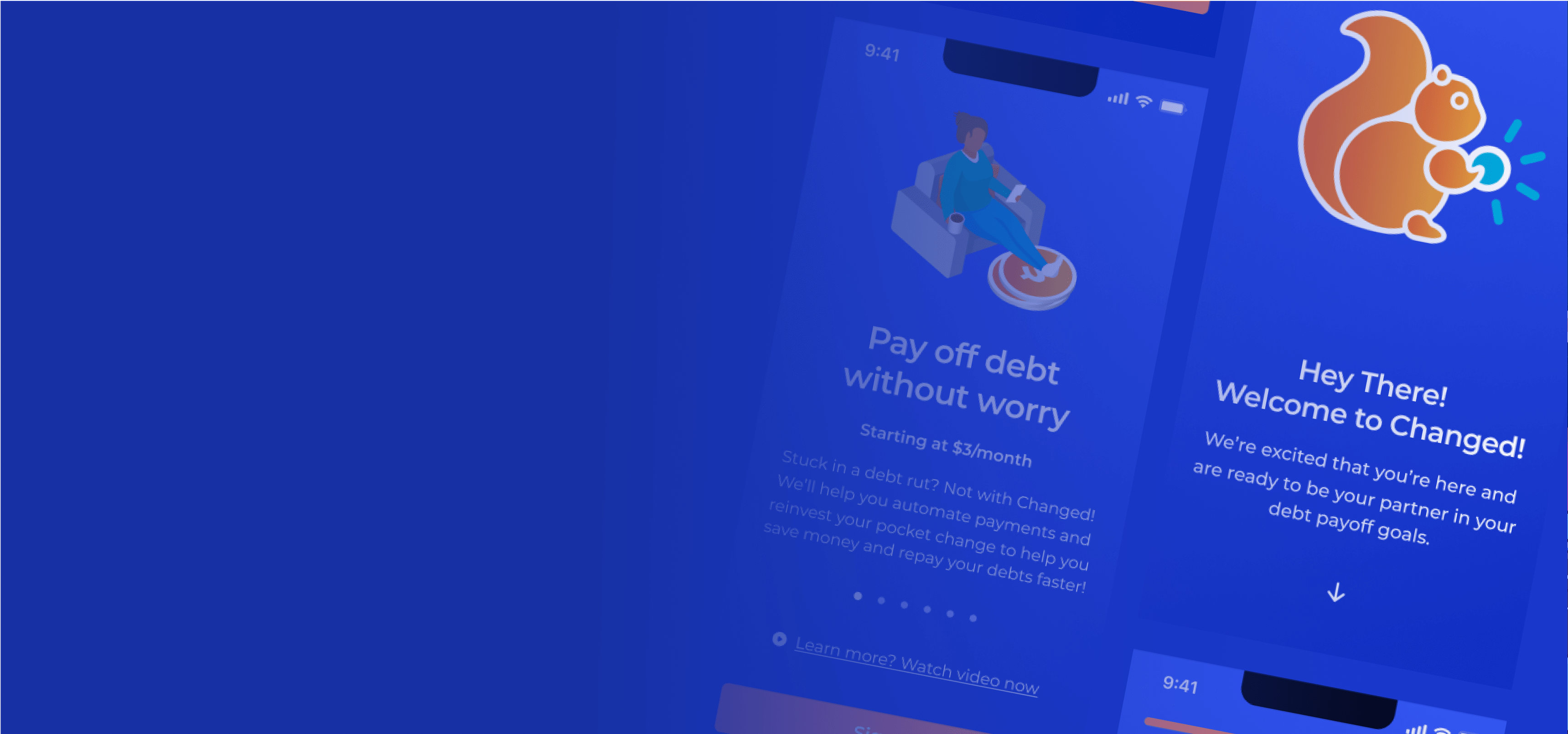
We designed light and dark mode for every feature, flow, and component.

Each interaction designed incorporated delightful interactions at the right time to
Overview
Changed is a debt-repayment mobile app that uses pocket-change reinvestments to help Americans effortlessly manage their finances.
Background
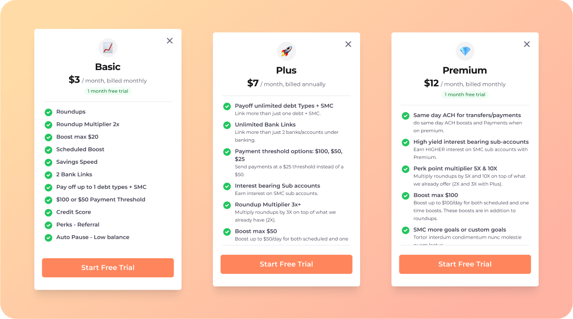
Since putting their name on the map in 2017, through ABC's Shark Tank, the app has helped thousands of users pay off one debt at a time via their 'Basic' Plan. However, with the introduction of 'Plus' and 'Premium' plans for multiple debt repayments, there is a need for a user-friendly way to make the most of these new features.
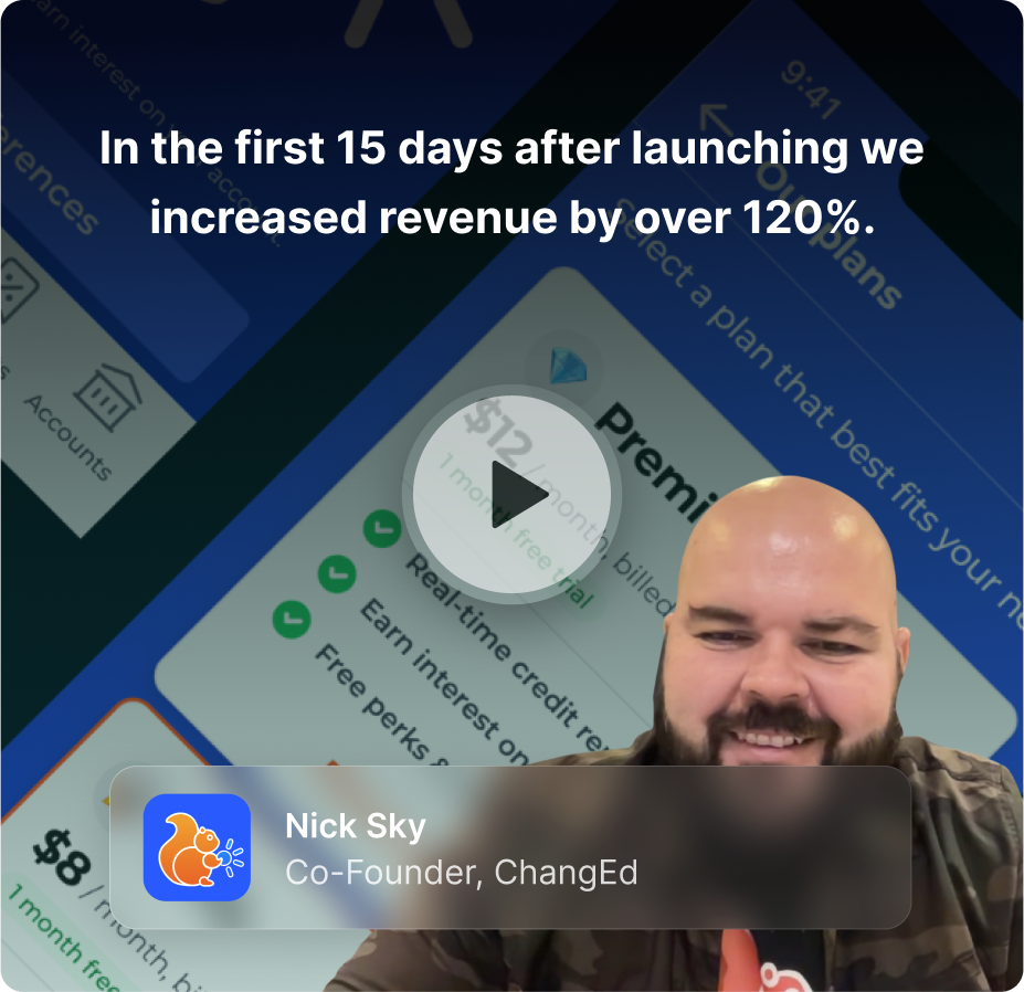
“In the first 15 days after launching we increased revenue by over 120%. It was a huge lift for us and is helping us grow as a company”

Nick Sky
Co-Founder, ChangEd
Objectives
- Transition design assets and system components from Sketch to Figma
- Create new features allowing for multiple simultaneous debt repayments.
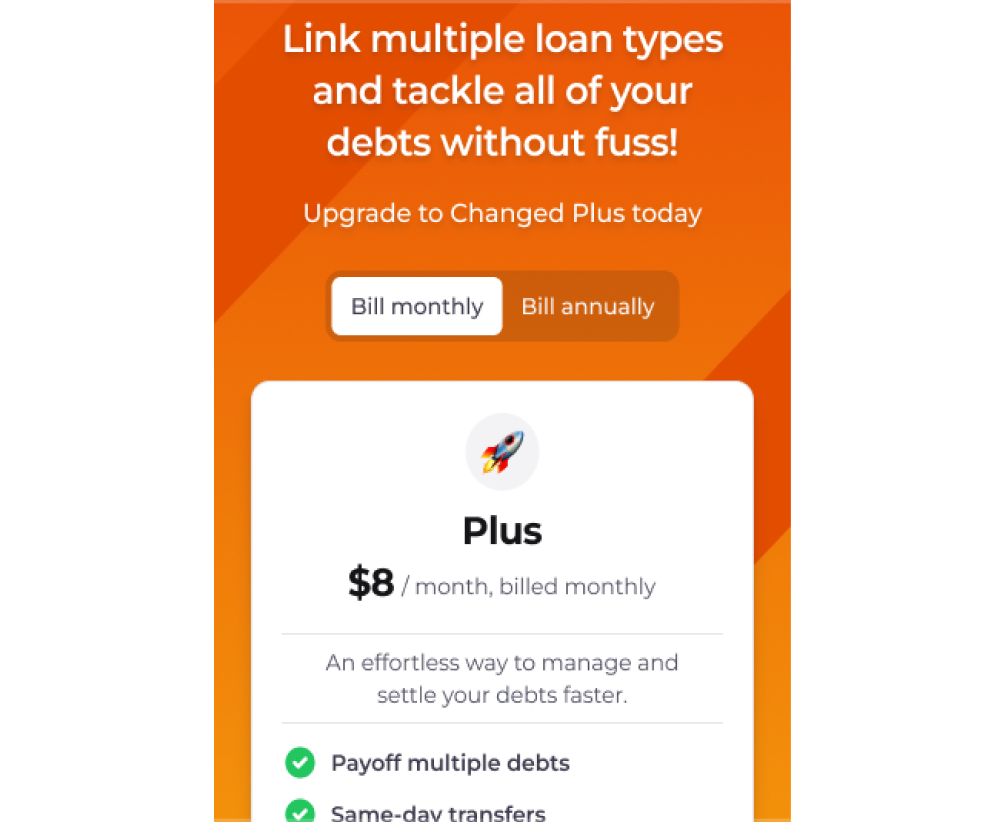
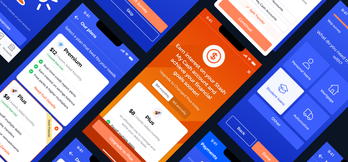
- Incorporate a novel membership tiering system into the existing platform.
- Unearth upsell opportunities within the mobile app's ecosystem
Strategy
To understand the platform thoroughly, the UX Cabin team joined hands with the Changed team to:
- Review the app's current functionality and visual design language
- Understand the business goals for the new membership system
- Define the requirements for the fresh set of features
“Everyone ramped up quickly and were kind of speaking like they were in-house team members after a week or so of understanding and playing with the product.”
Nick Sky
Co-Founder, ChangEd
Project Constraints
Although the team was able to take some liberties with general UI improvements throughout the platform, the scope of work was restricted to a set list of new features.
For Basic Membership flows:
- Onboarding
- Membership management
For Plus & Premium Membership flows:
- MVP multi-debt features
Strategy Development: Upsell Opportunities
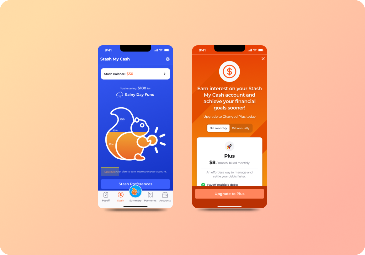
Upselling strategies were a primary focus. We opted for a needs-based approach, designing tailored upgrade prompts to unlock additional features precisely when users require them.
Upsell: Stash My Cash
On the Stash My Cash savings account, users will see the message, "upgrade your plan to earn interest on your account", under the summary infographic. Upon click, users can learn about Plus/Premium perks.
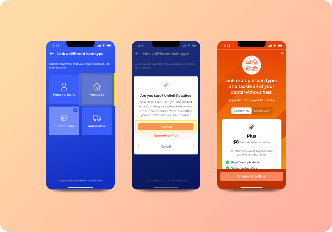
Upsell: Unlink Debt
For Basic plan users, an attempt to change or add a new debt-type will initiate a modal popup informing the user that they are limited to only one debt-type. The user can then either update the linked debt, or upgrade to Plus or Premium to link multiple debts simultaneously.
Redesign: Onboarding
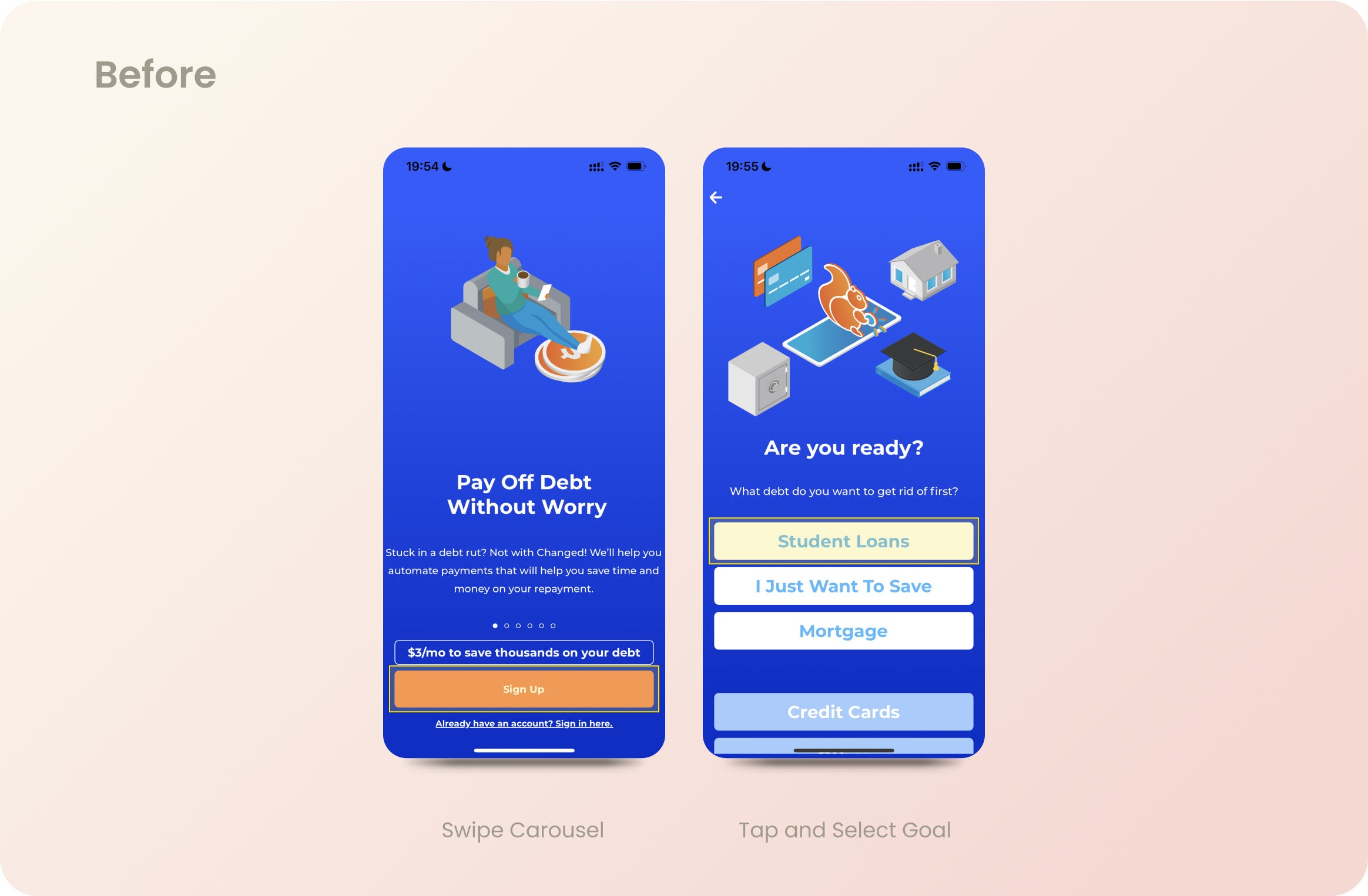
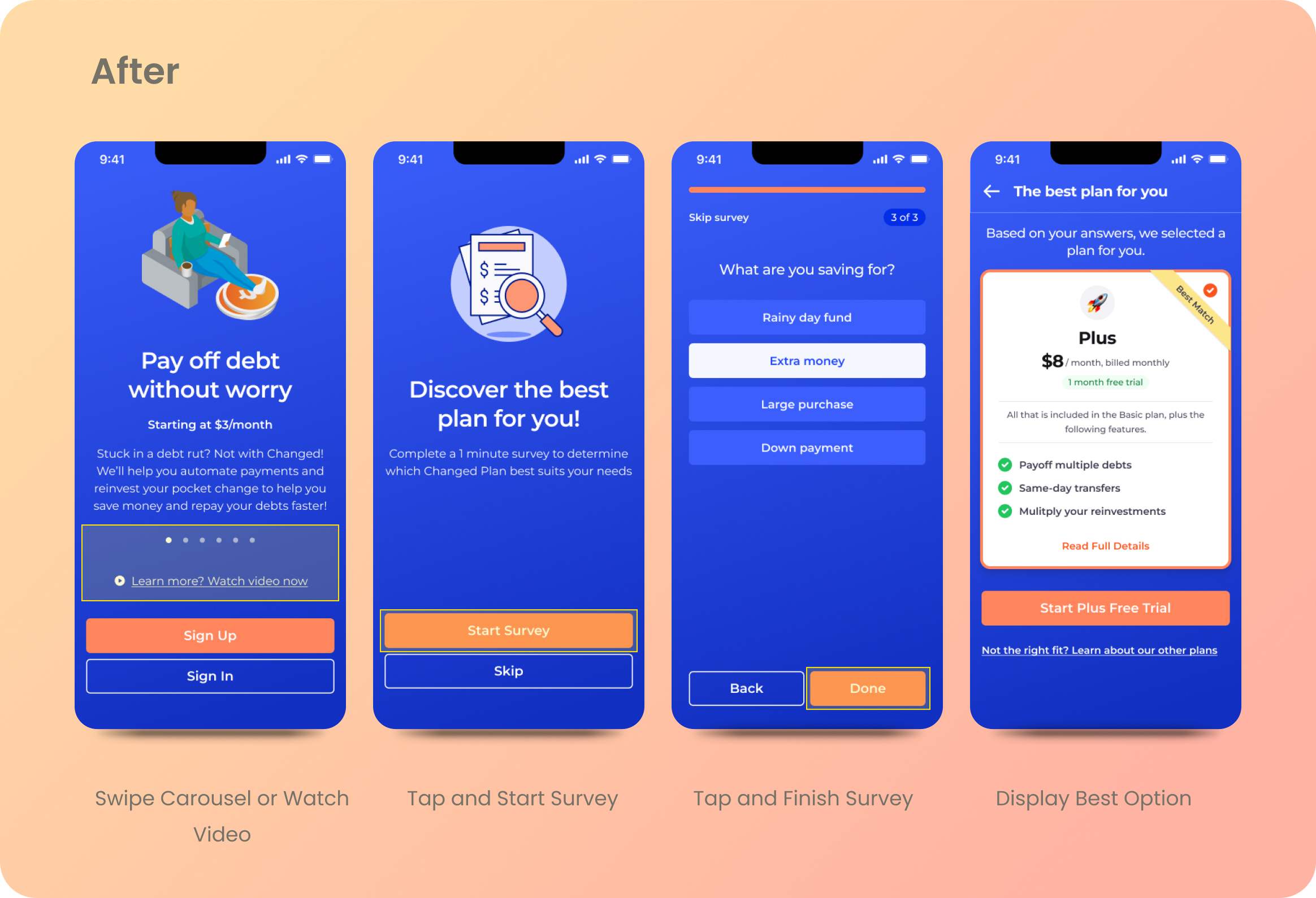
In the original app onboarding process, users were introduced to the platform through a carousel and were asked to choose a type of debt to start setting up their account.
The final design streamlined this process with a carousel, an optional intro video, and a 1-minute questionnaire, providing information on the available plans and guiding users towards the most suitable one.
Before
After
Redesign: One Time Boost Deposit
Before
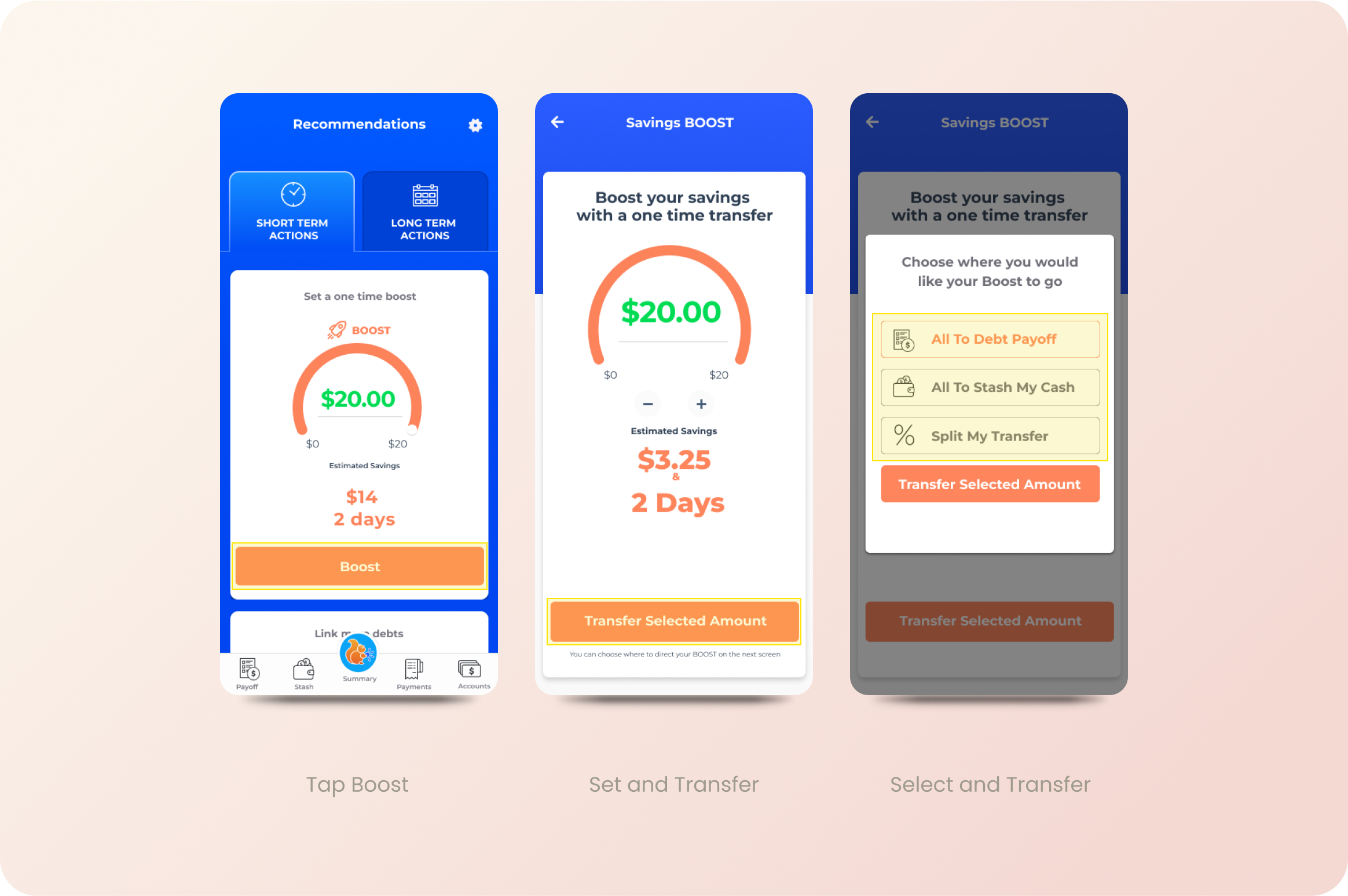
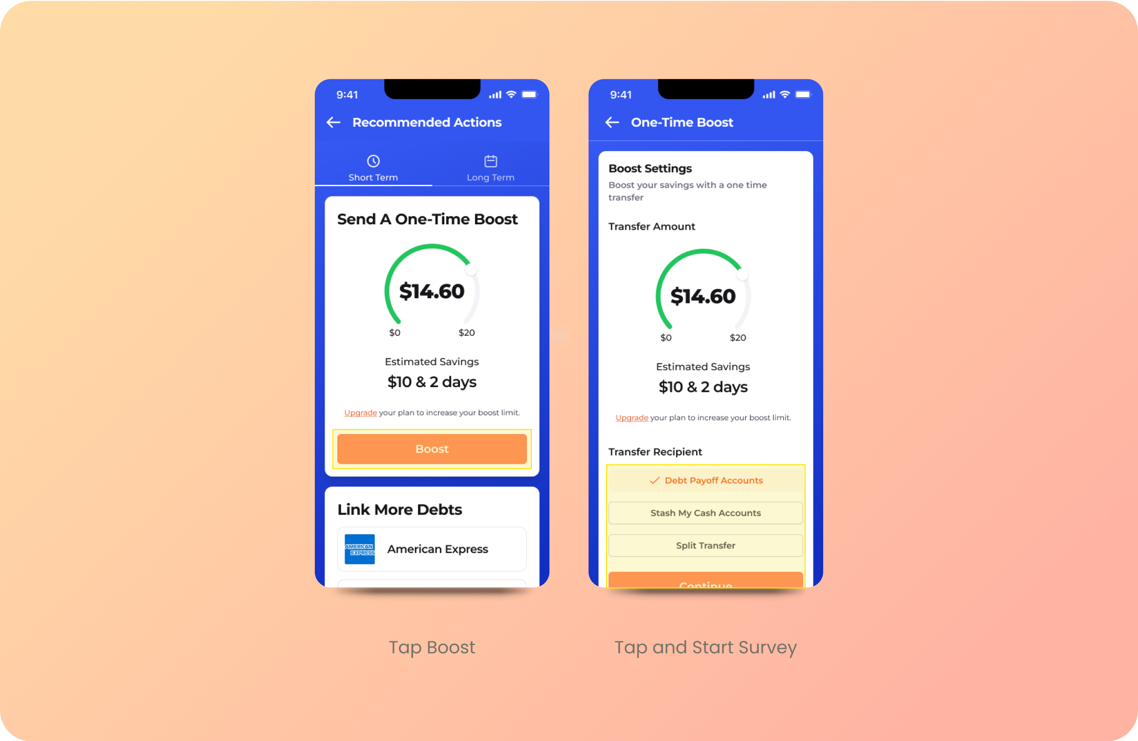
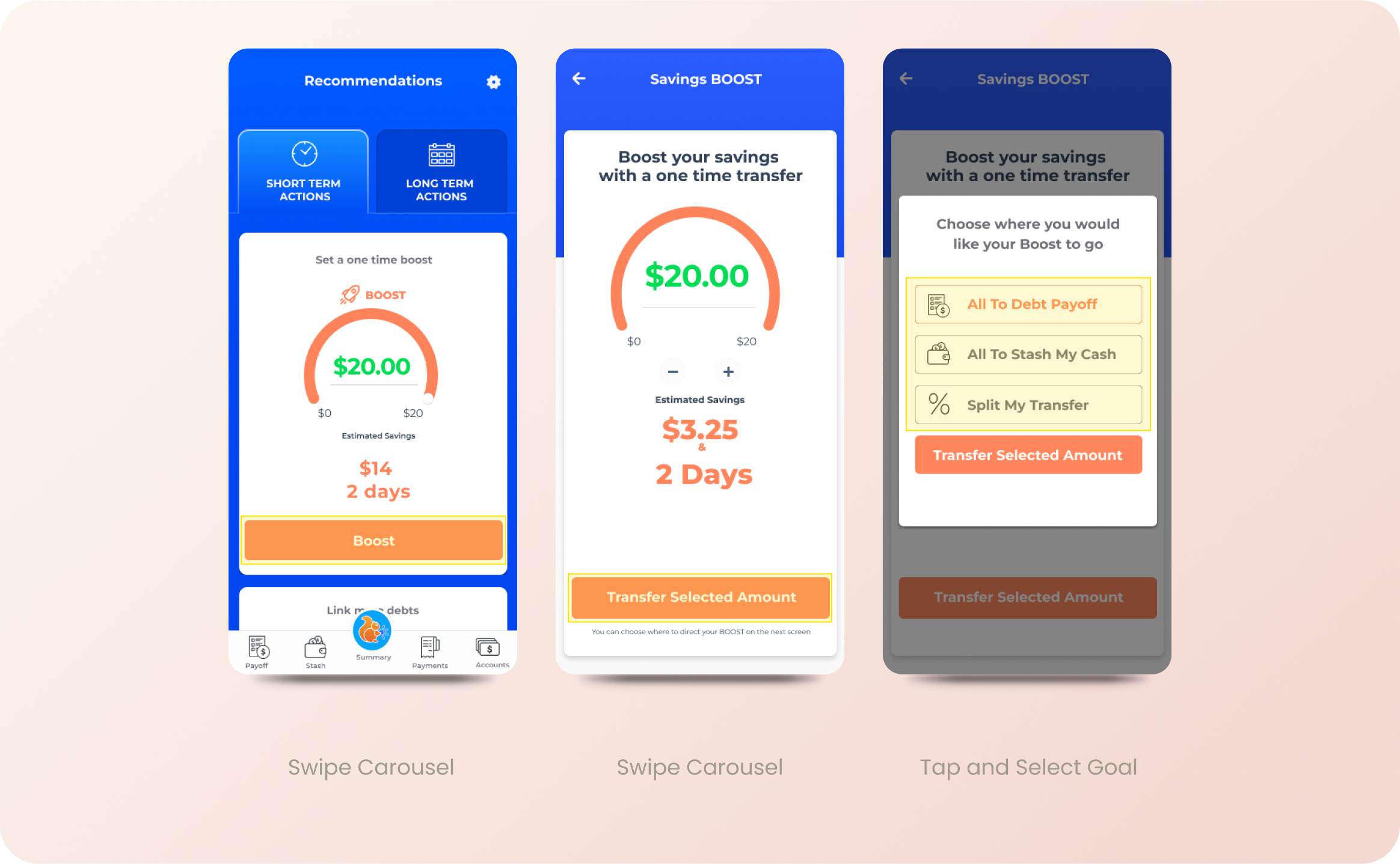
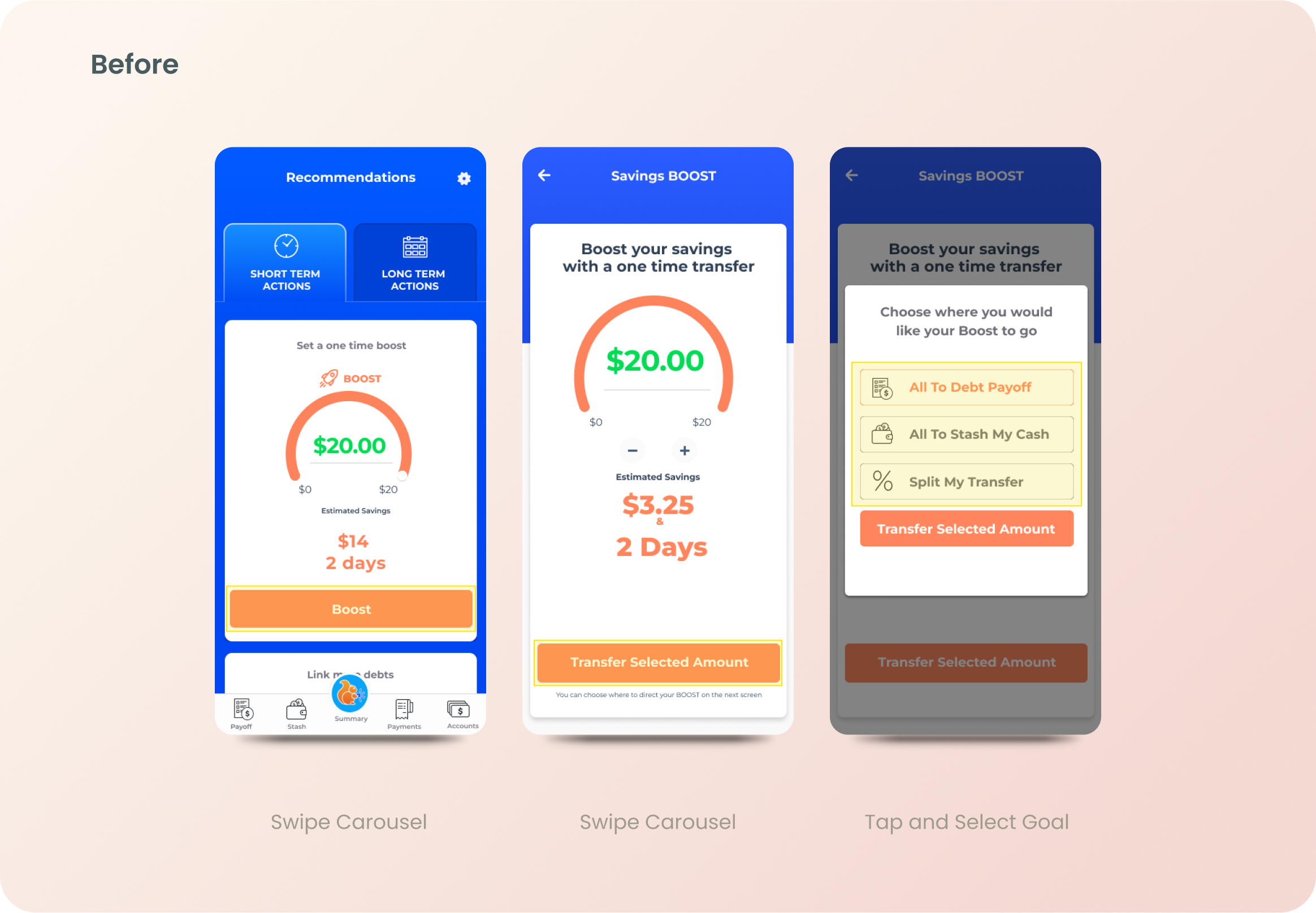
The "One Time Boost" feature previously allowed users to allocate "boost" deposits across their debt-payoff accounts, "Stash My Cash" savings accounts, or split across all accounts.
After
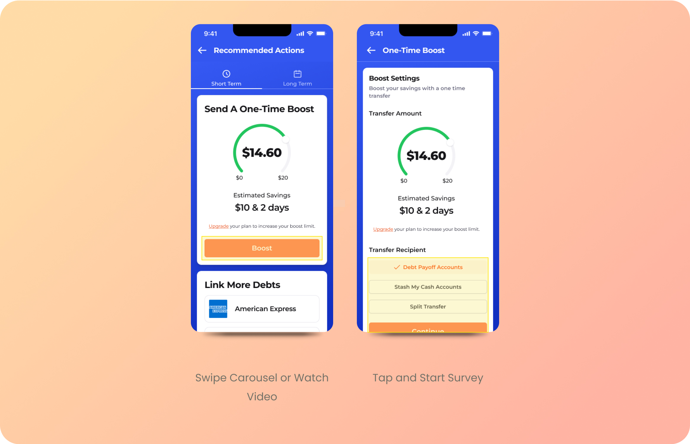
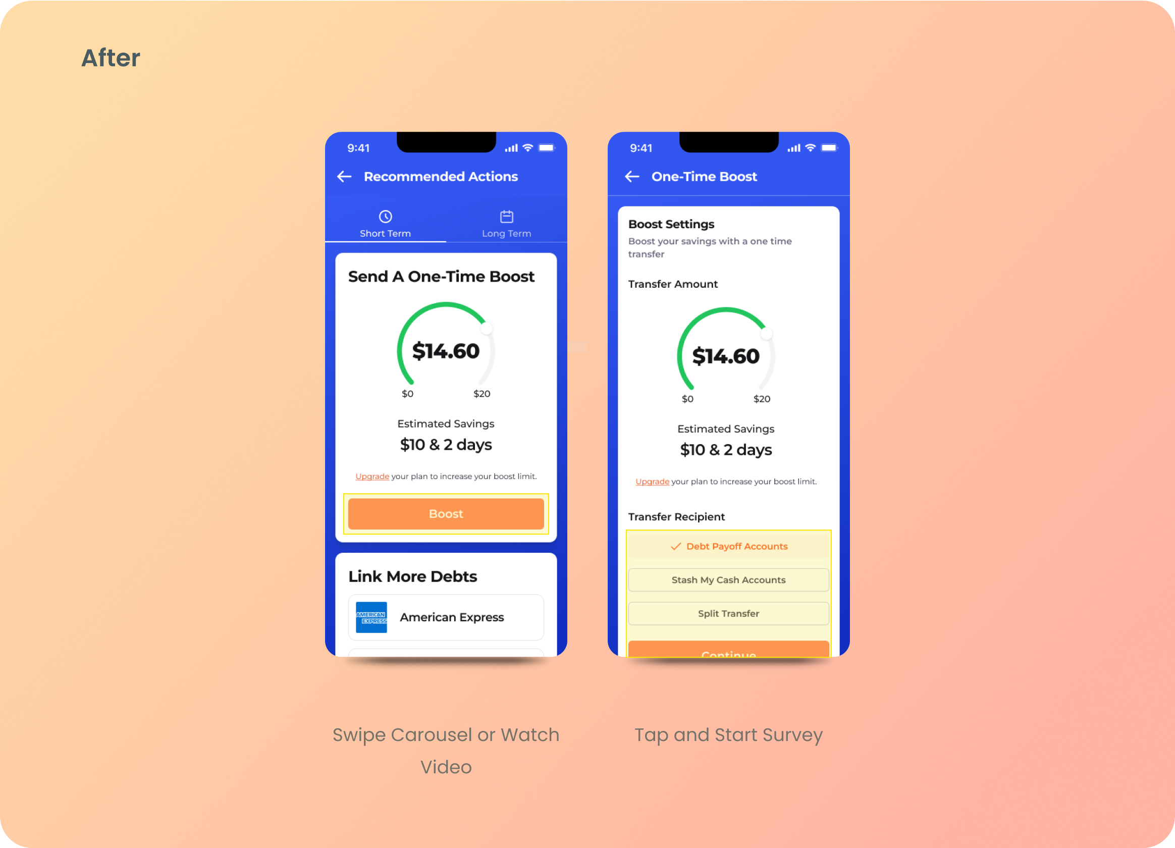
The font size, weight, and color improvements enhanced accessibility and overall UI. We also refined the "boost" flow to reduce the steps required to submit a deposit, making the "Split Boost" process more precise.
New Feature: Multi-Debt Savings Split
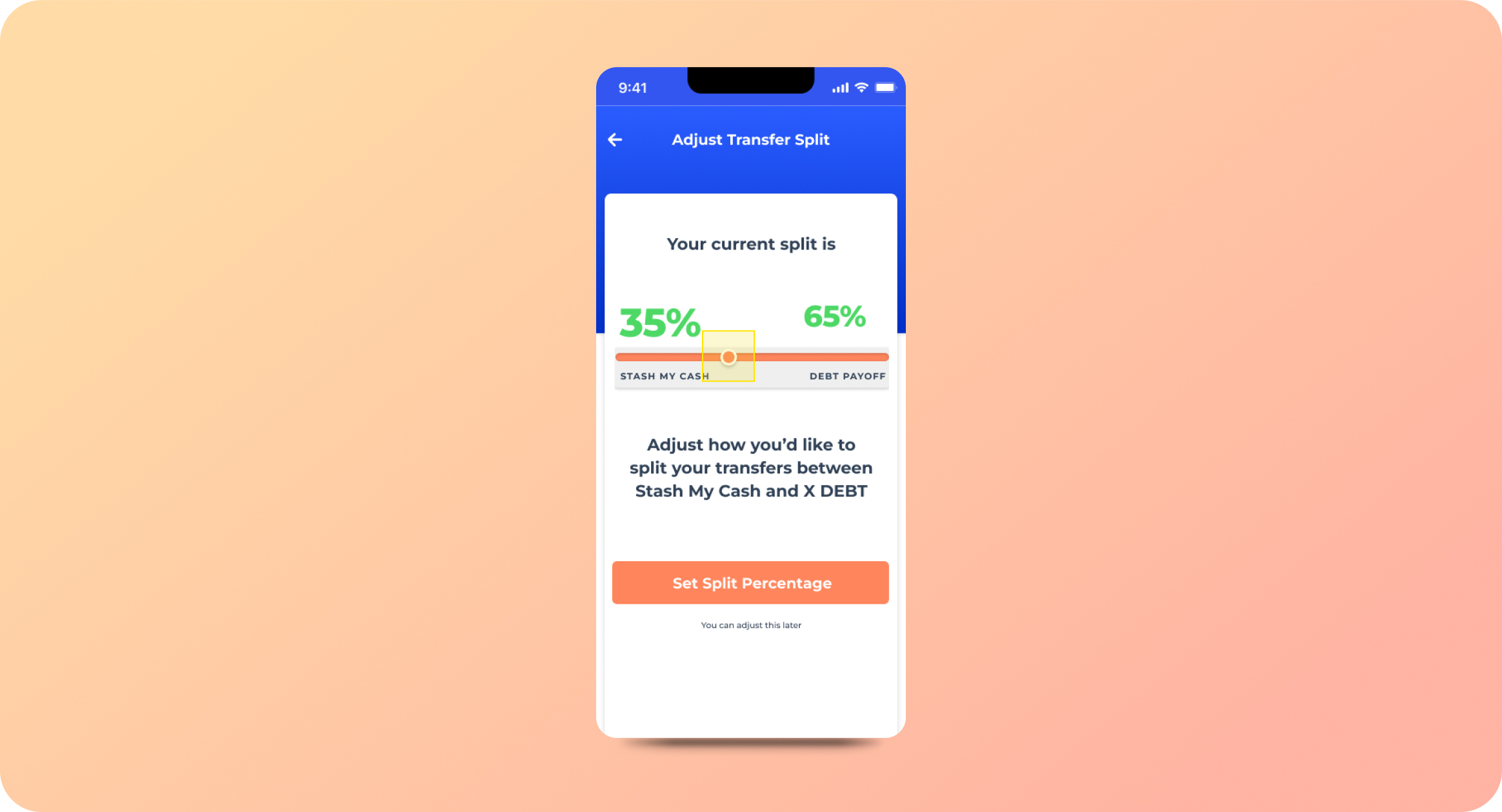
Before
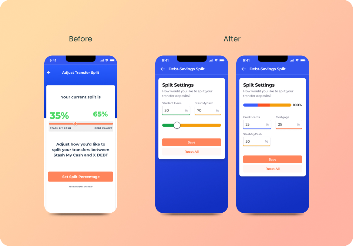
The existing "Single Debt-Savings Split" feature allowed users to split their transfers between their linked debt and their Stash My Cash savings account.
Before
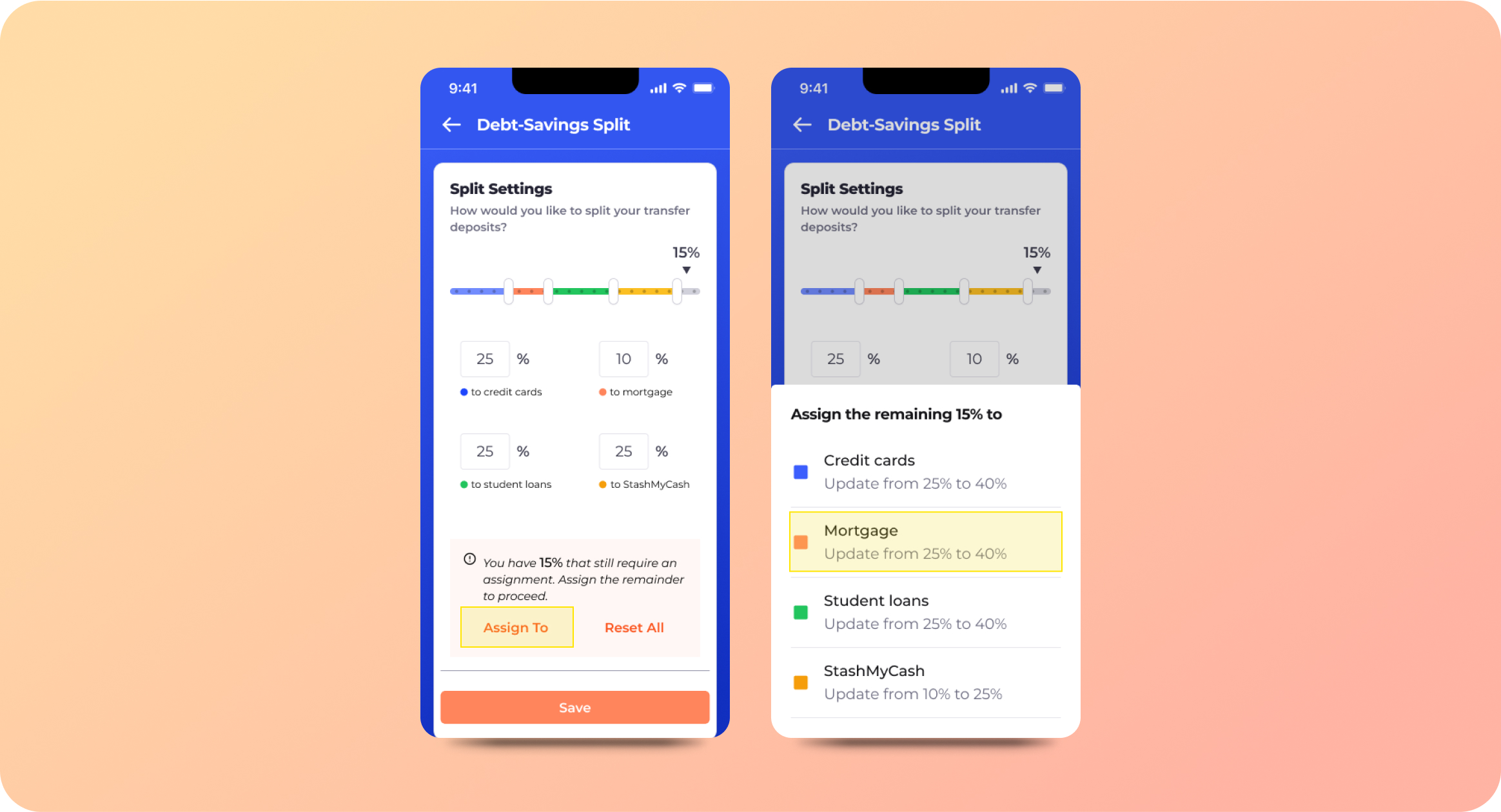
Initial Iterations
Initial iterations included a multi-slider feature and autocorrection feature for unacceptable split submissions.
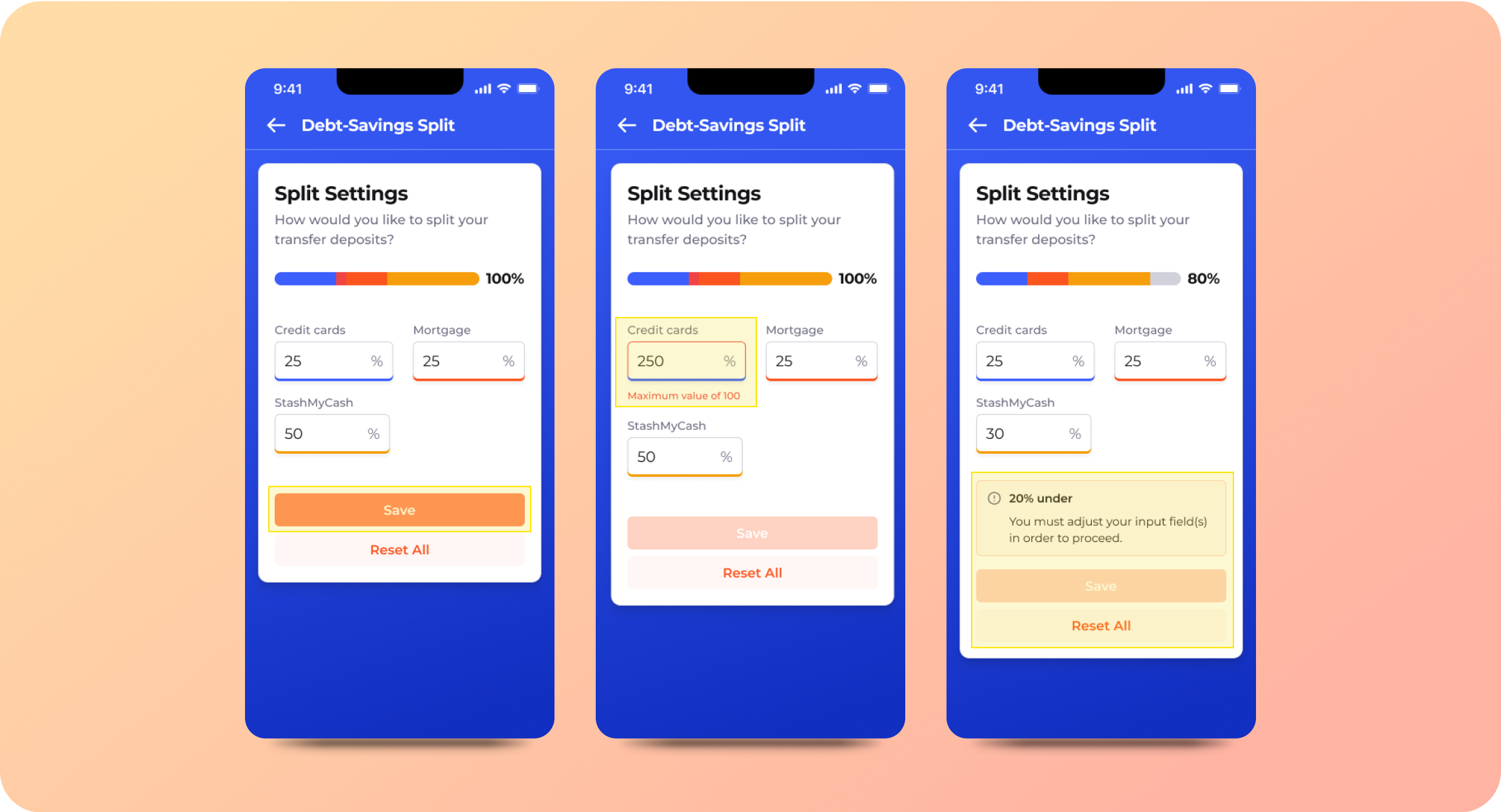
Final
To simplify the user flow the auto-corrective feature was changed to a minimalist error message. Manual input fields were added to allow users to precisely allocate funds across all connected accounts.
Results
Our involvement enabled Changed to transition smoothly into a comprehensive, multi-tiered, and multi-debt payoff application. The result? A 120% surge in revenue within 14 days of the launch and a high approval rating from platform users.
"I think of UX as how many times can I make a customer smile ... or say 'wow' when using my product? The team at UX Cabin helped us build those wow moments throughout the entire experience"

Nick Sky
Co-Founder, ChangEd