Case Study
Financial Product Suite
A suite of financial products to help manage overseas illiquid investments for high net worth individuals
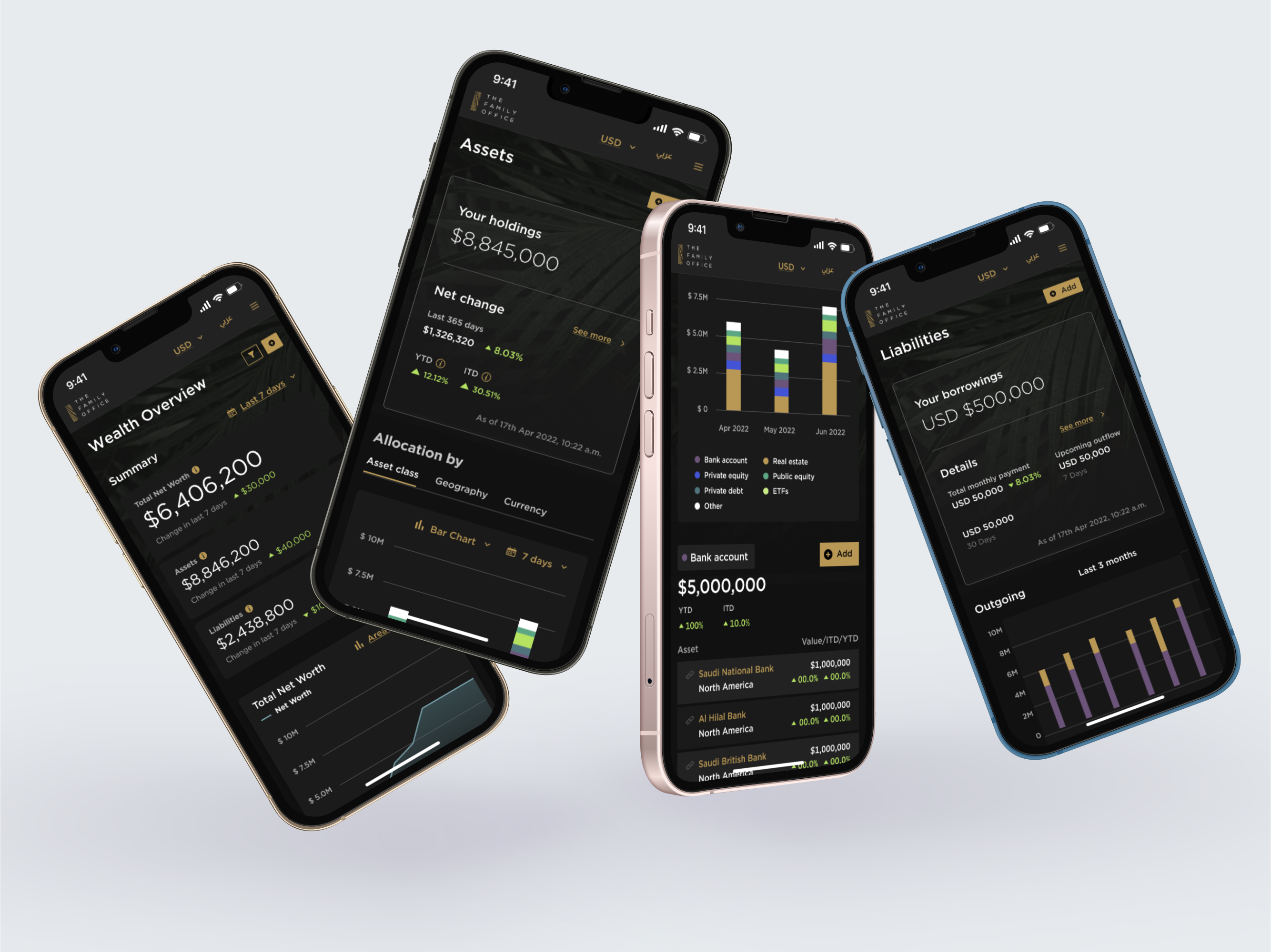
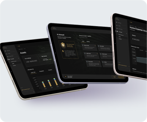
🌐 Multi-Product Platform
We designed numerous products within the product ecosystem
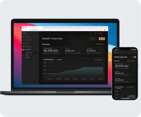
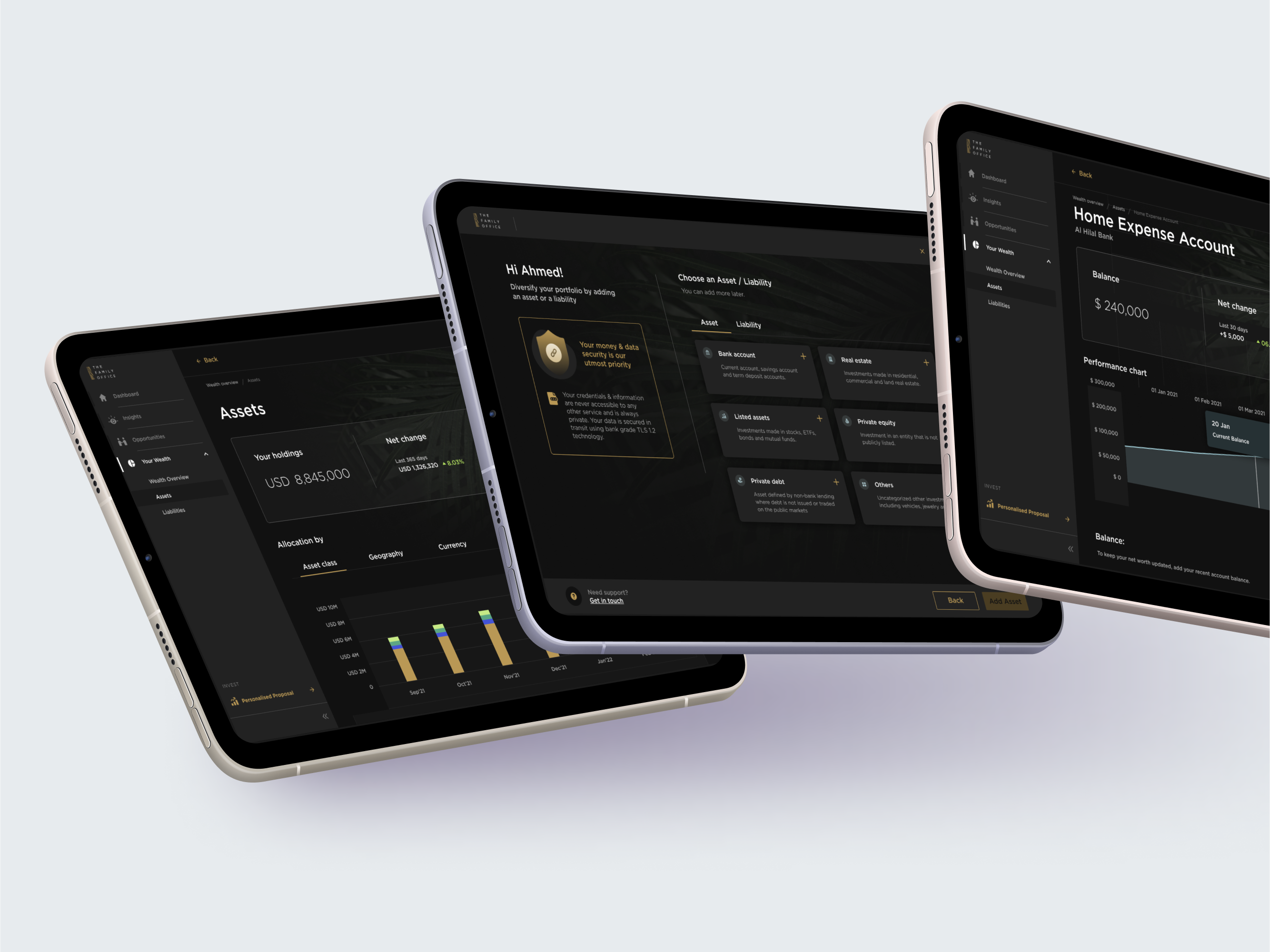
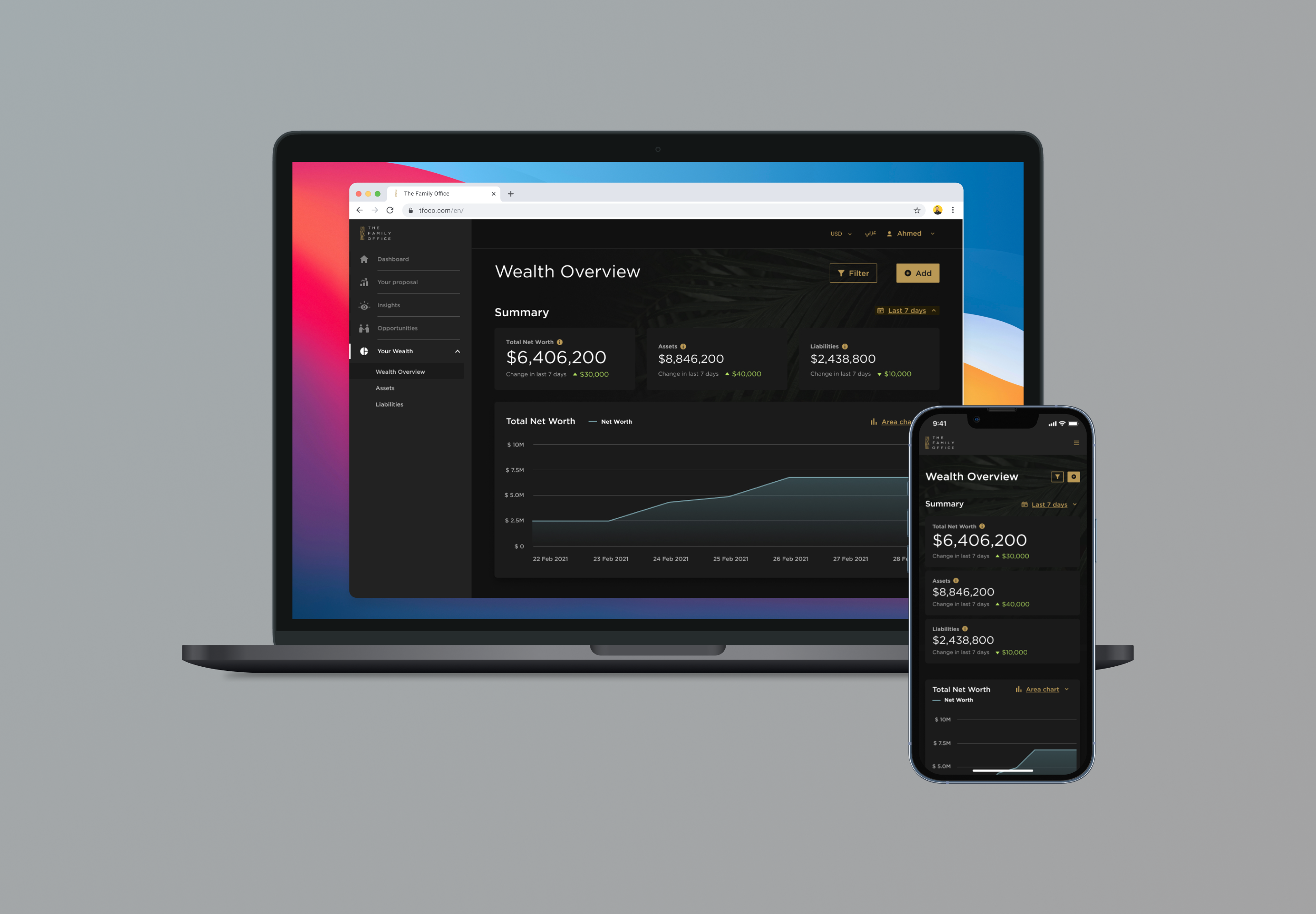
📱 Web & Mobile
Applications spanned from internal web application to consumer facing mobile apps
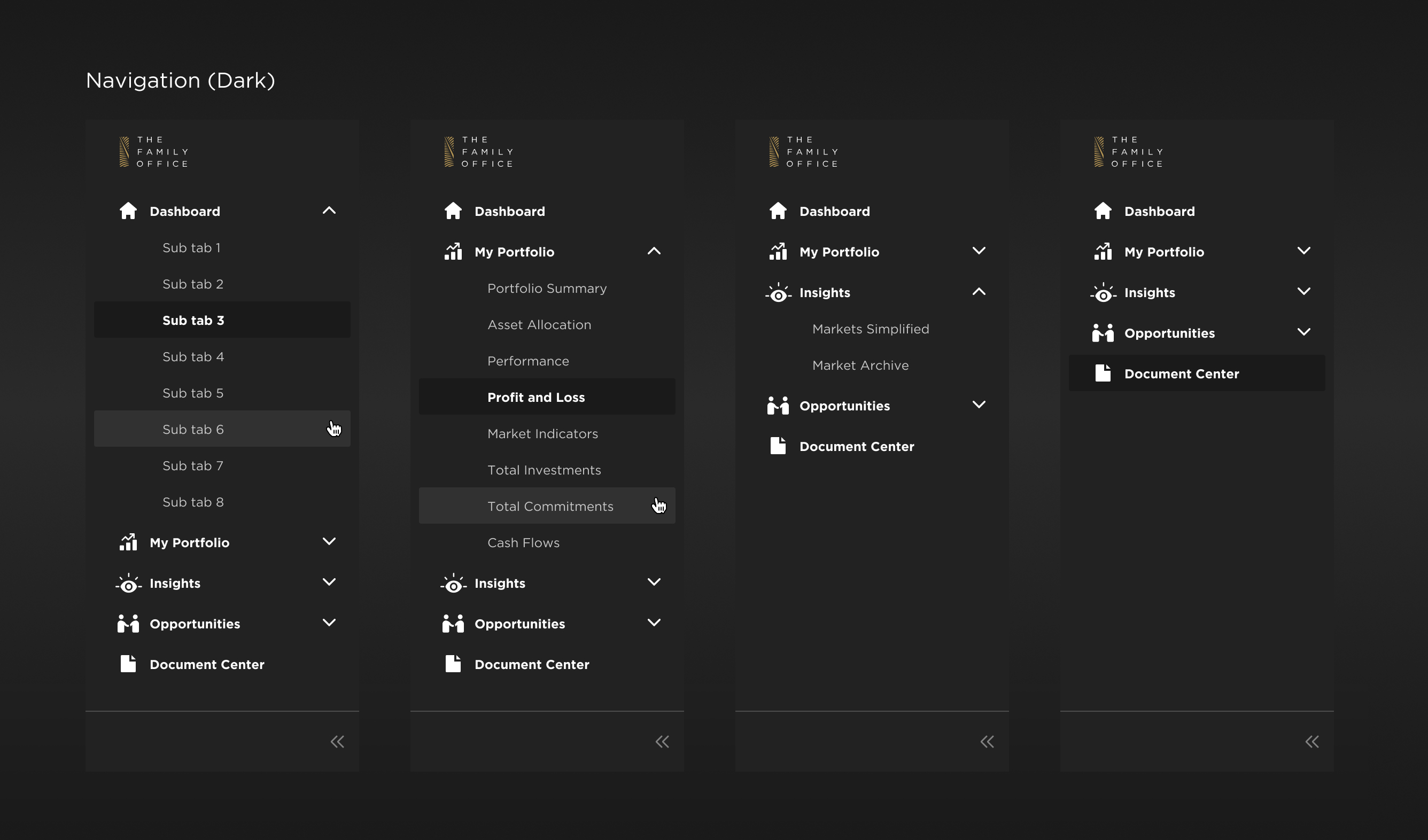
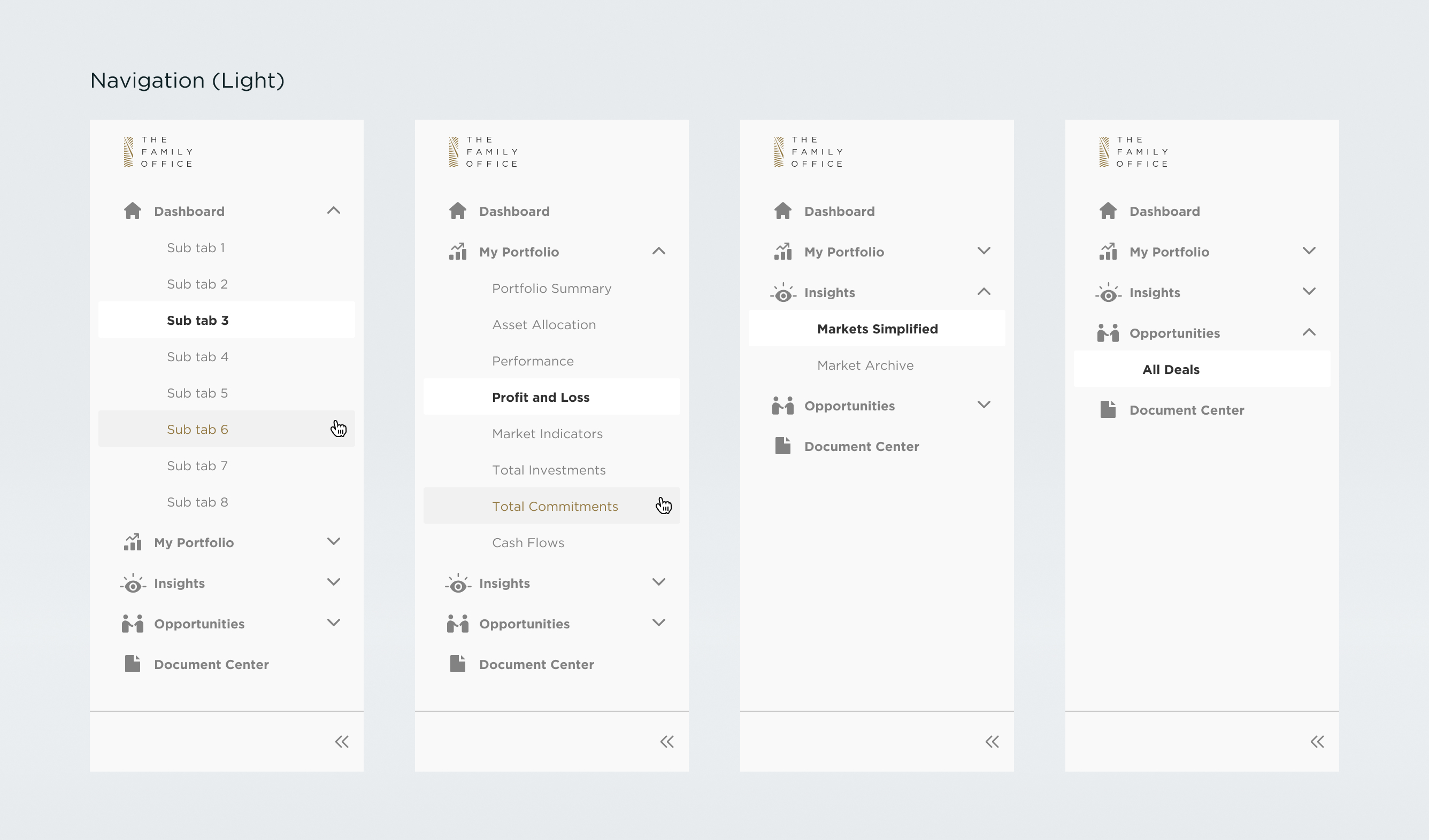
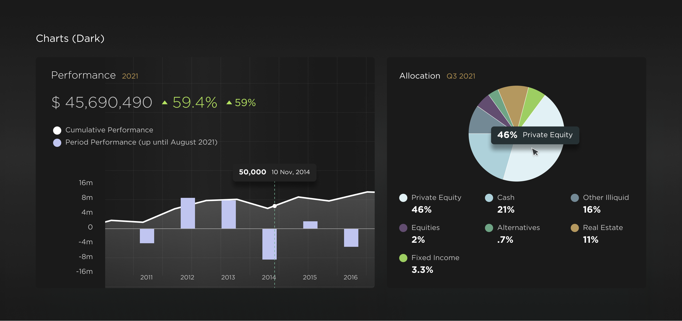
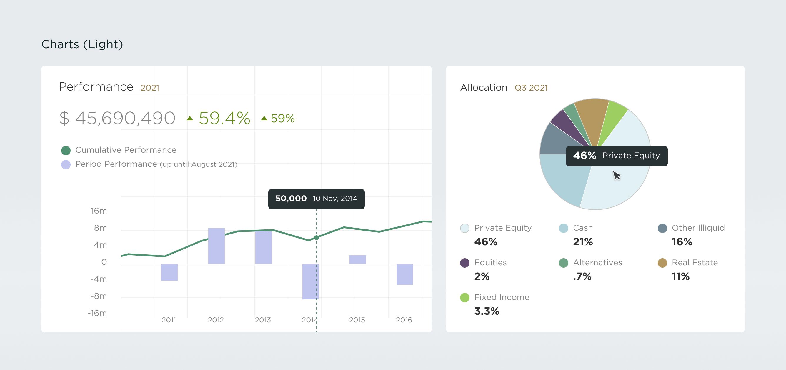
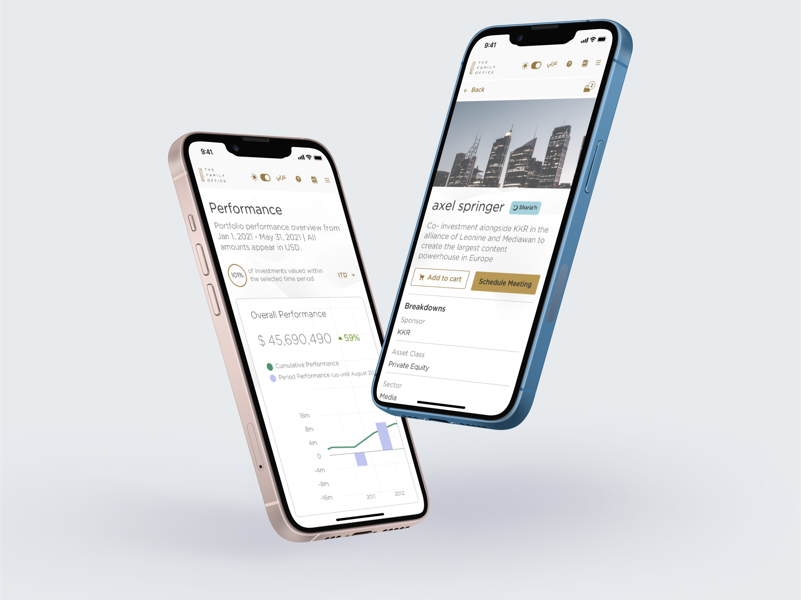
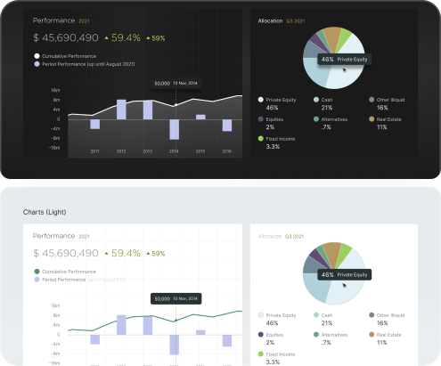
🌓 Light and Dark Mode
We built a highly scalable design system that spanned products and themes
Overview
Over the course of two years UX Cabin helped modernize The Family Office's way of business by bringing manual processes online, streamlining onboarding, improving account management, and giving client access into online platforms for web, mobile and tablet.
Background
The Family Office is an independent wealth management firm serving some of the wealthiest families, individuals and investors in the GCC. They brought in UX Cabin to help manage the UX process and build new applications across their digital product line.
Objectives
- Create a premium experience for their clientele
- Make a beautiful, seamless application across web, mobile, and tablet
- Maintain a cohesive design and user experience across their various products
Strategy
- Understand the users sensibilities, desires, and core business goals
- Create efficient flows to maximize transparency among clients
- Provide customized investing plans and opportunities for individual clients
Design
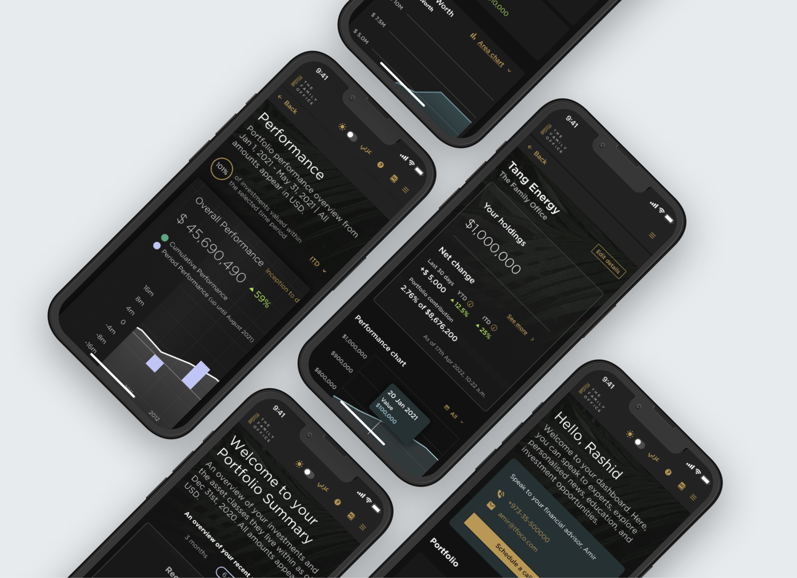
Our goal was to design a beautiful, scalable application that included readable charts and graphs, scannable data, and clear actions for complex workflows.
Principles
- Premium, luxurious appearance
- Informational UI
- Progressive revelation
- Clear, digestible information
Process
When approaching new features or products we would start with requirements gathering, user data, and research that would inform our design decisions.
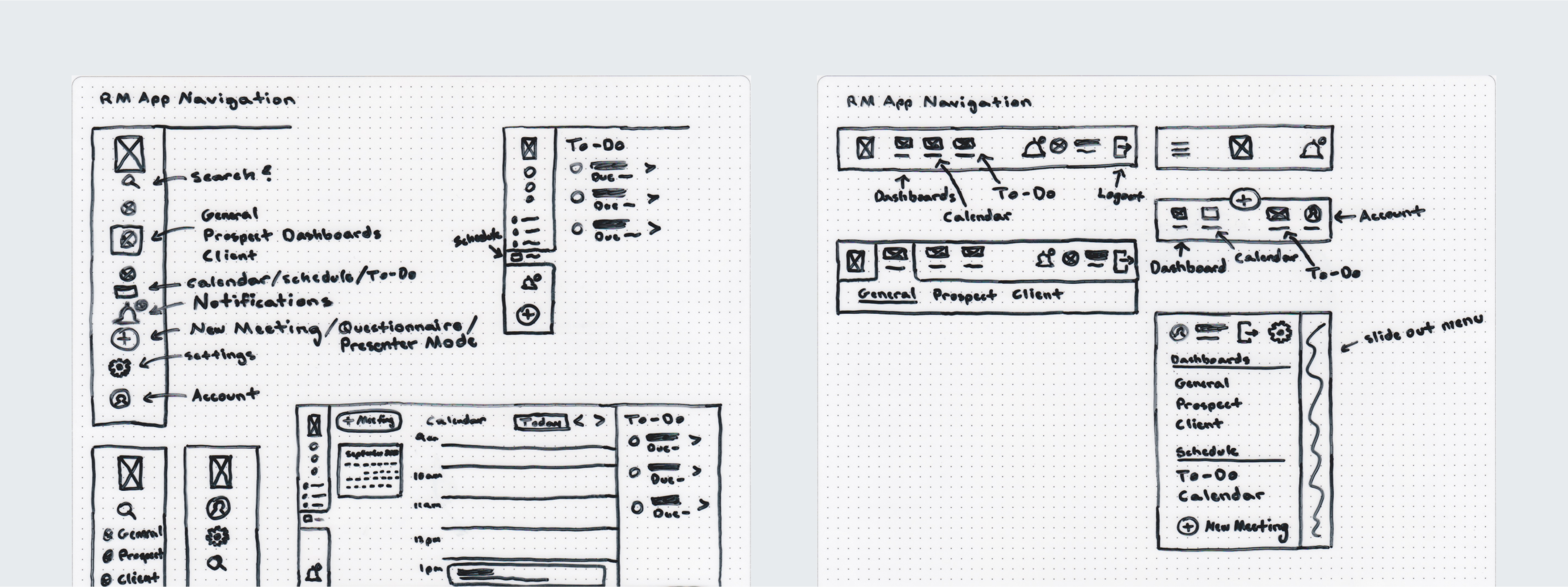
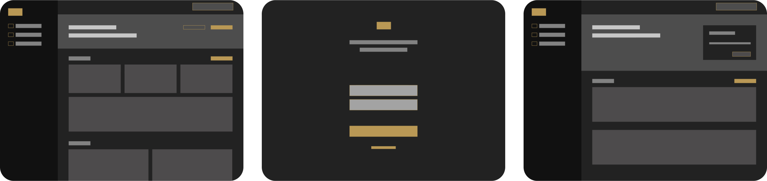
Wireframes
From there we would either sketch or wireframe new features, or build existing features using our DLS (Design Language System).
High Fidelity Designs
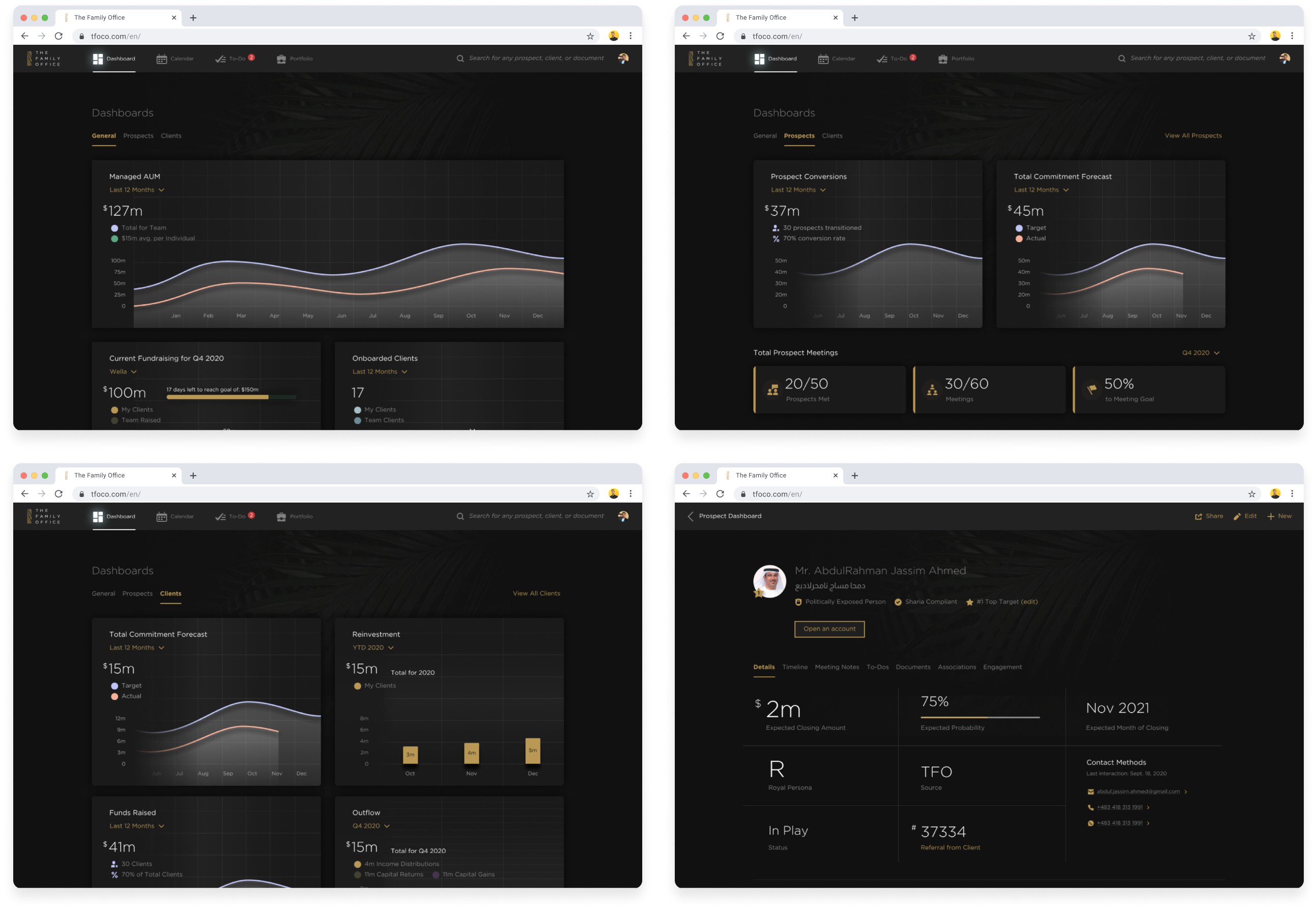
From there we would take wireframed designs to high fidelity mockups. In most cases these included mockups for mobile, tablet, and desktop.
Developer Handoff
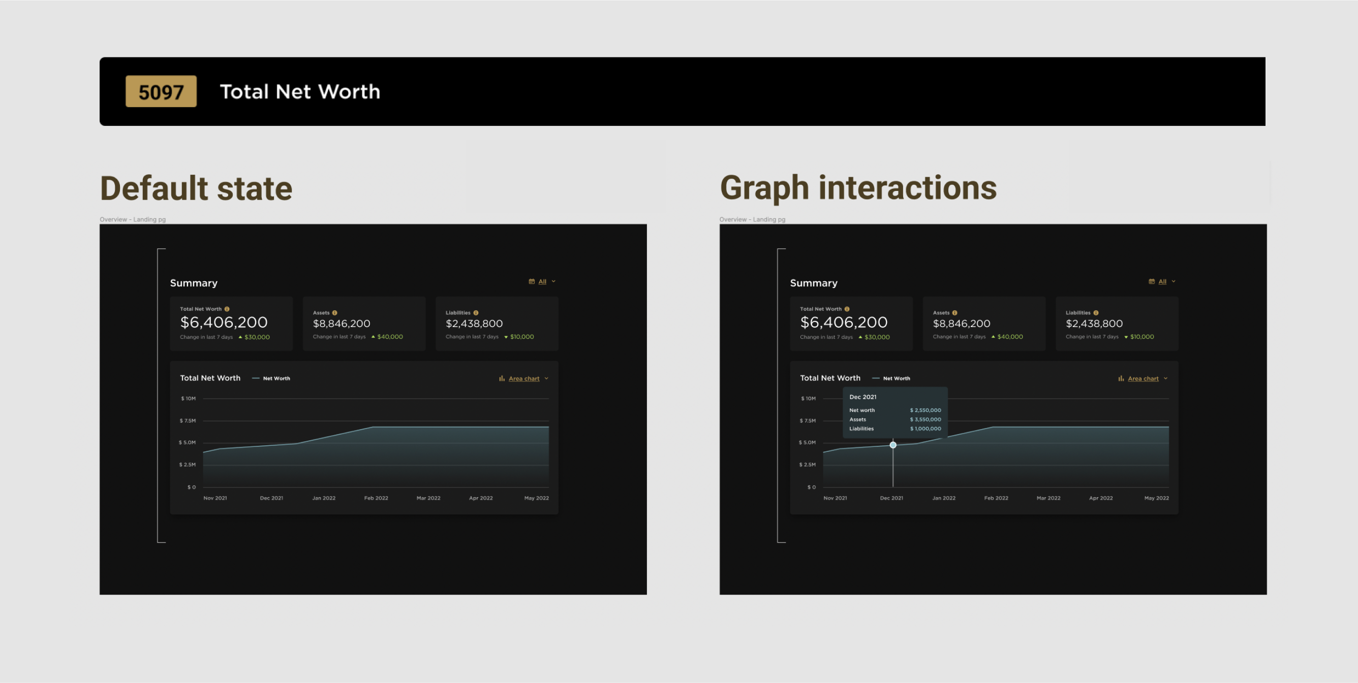
We worked tirelessly to communicate each screen and feature explicitly so that it took out all guess work from developers. This includes dev notes, release comments, explanation of functionality, and links to user stories.
Design QA
Throughout the product development lifecycle we would routinely QA applications to make sure they matched design intent and functionality of the DLS. This is a core aspect in our approach as it takes many hands to ensure designs are implemented correctly.
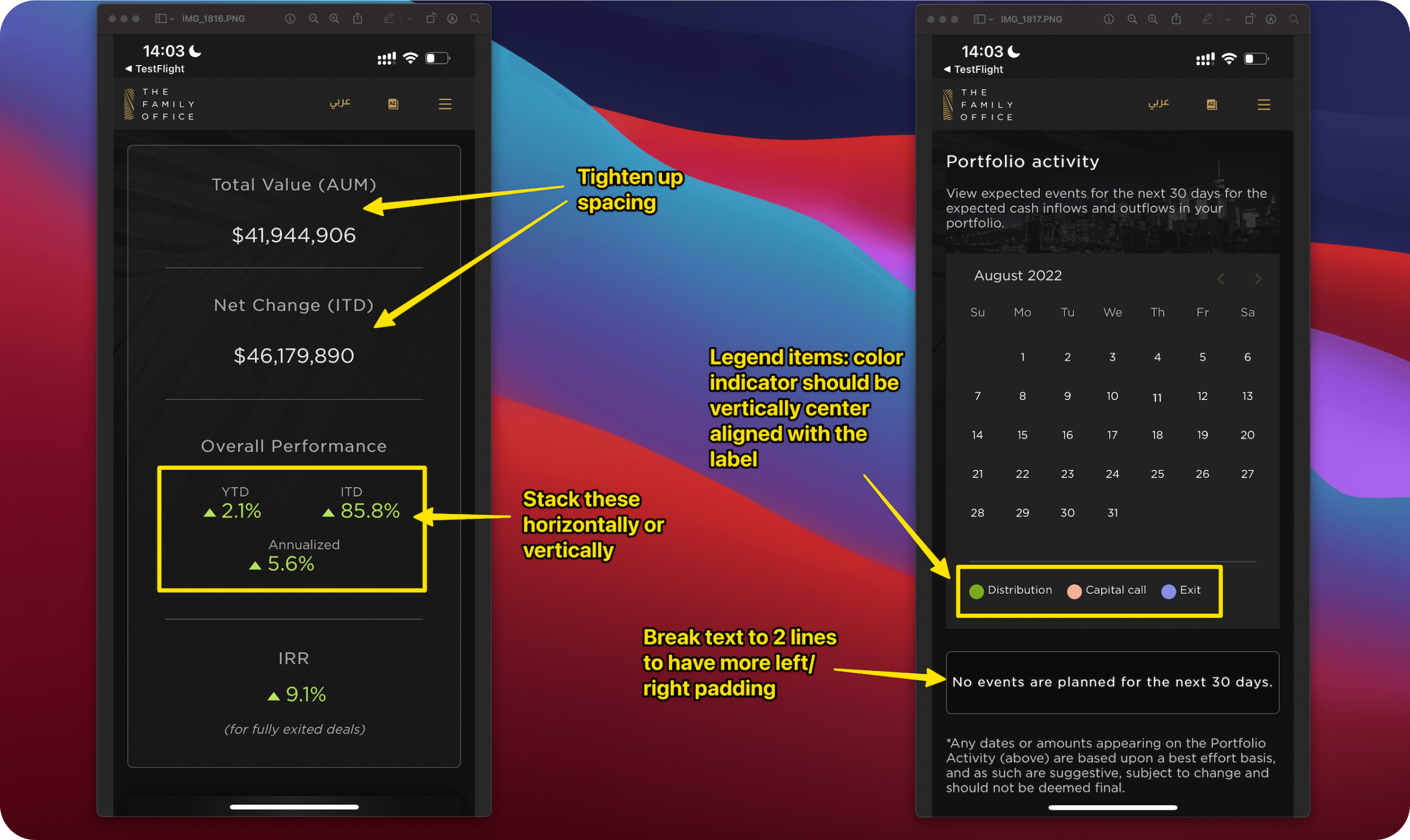
User Testing Adjustments
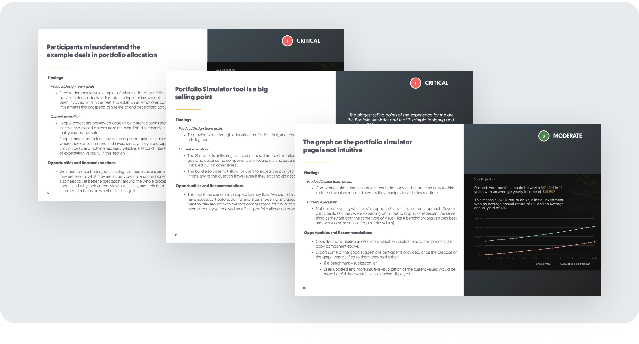
During design releases and after launch we worked hand-in-hand with UX researchers to modify and improve existing design features through interviews, research, and user testing.
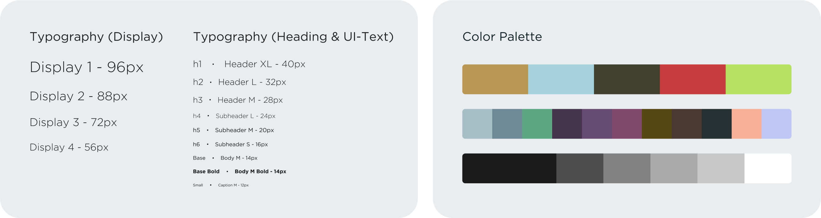
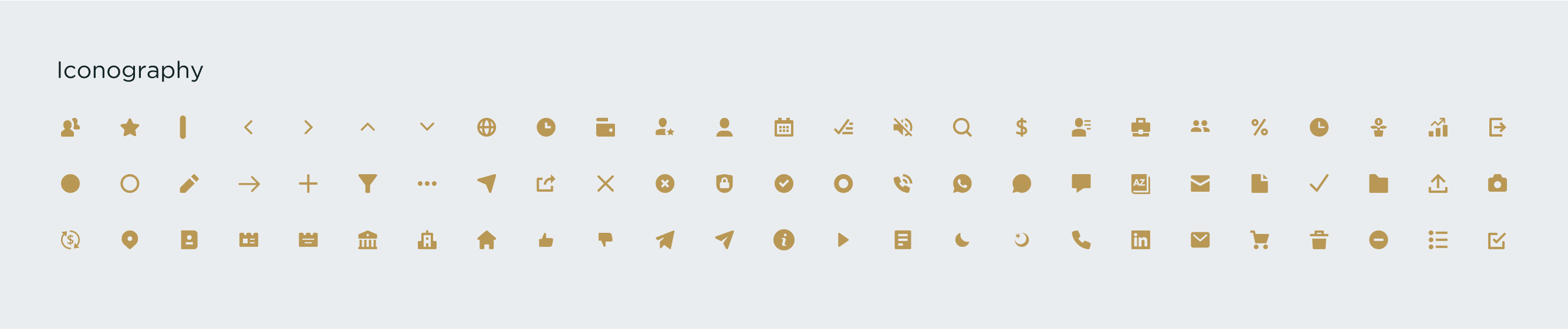
Design Language System
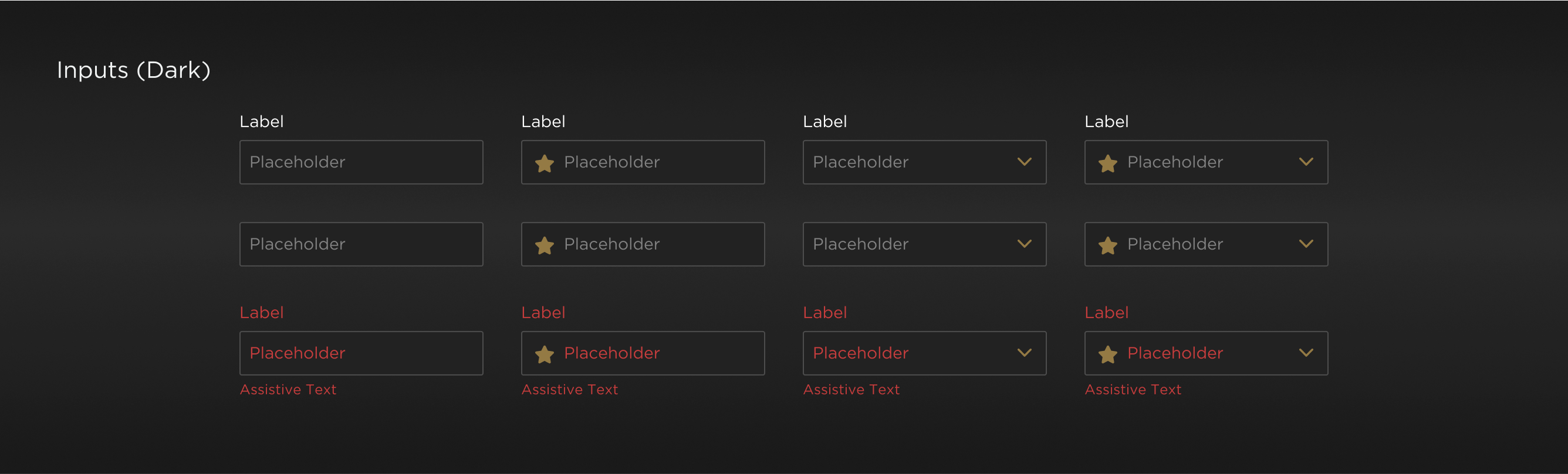
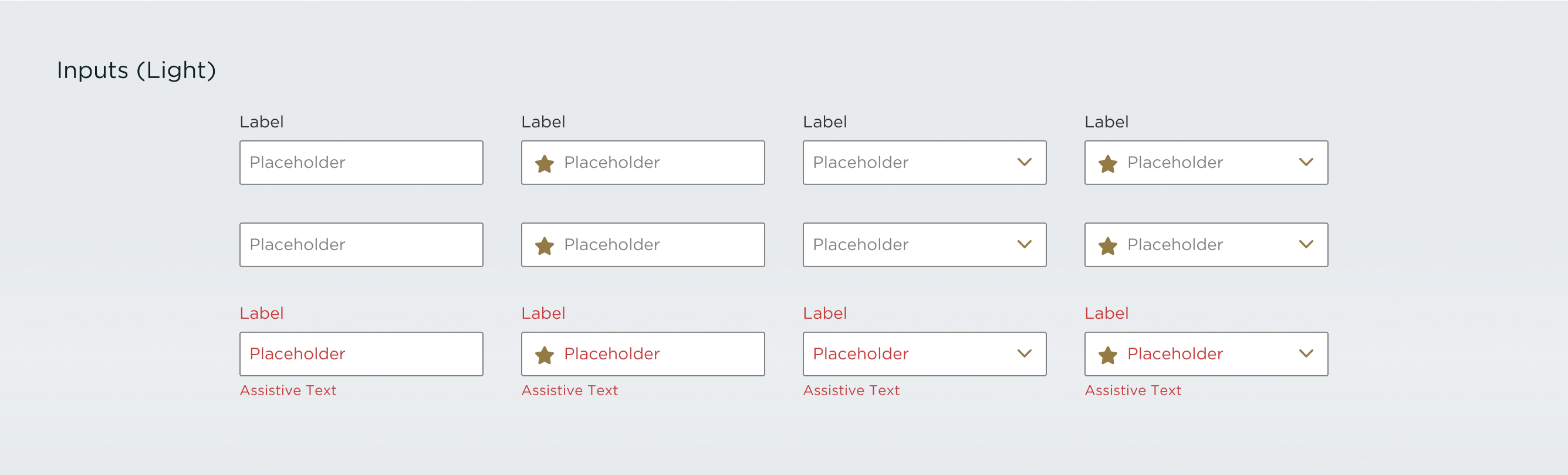
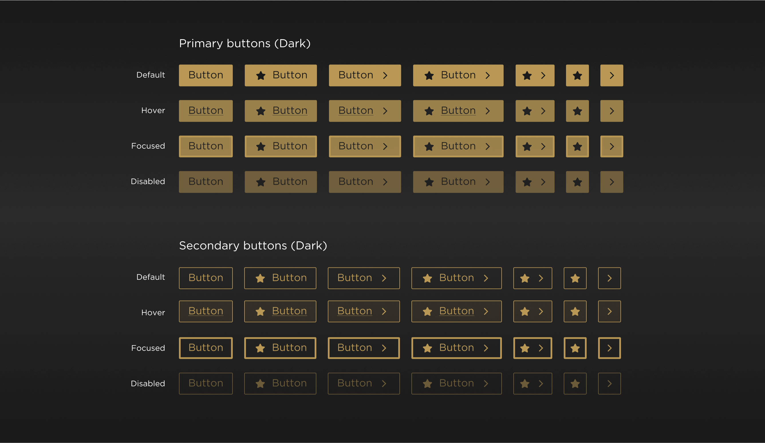
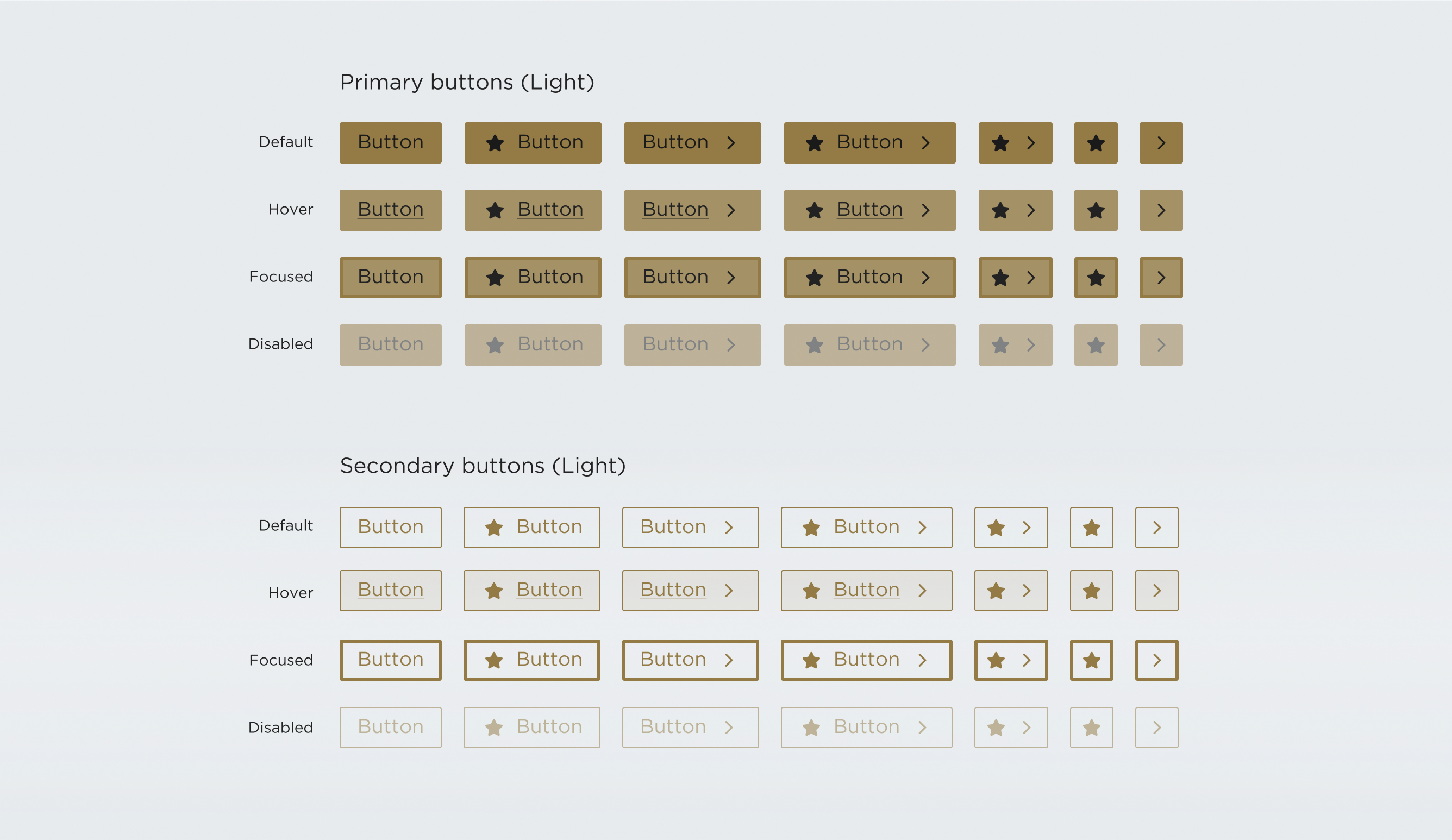
We created a visual design language system that served as the source of truth for all applications and platforms within TFO. This was important because anything we solved in one area we wanted to share that context with other apps within the ecosystem.
Building this helped saved hundreds of hours of design and developer time in future designs because we had a system of answered questions we could refer to whenever we needed to build a new feature.
Atomic Design
The Design System was created with Brad Frost's "Atomic Design" philosophy. In this model, the smallest UI elements are referred to as "atoms" (ie, icons, labels) and are assembled together in order to create components referred to as "molecules" (ie, buttons, inputs). Molecules are put together in order to create more complex components called "organisms" (ie, cards).
Principles
- Dark & light mode possible
- Minimal, yet beautiful
- Luxurious and premium
- Specific enough to be useful
- Shared access across many platforms
Final Screens