Case Study
Vital Signs Monitoring Apps
Transforming User Experience for Better Patient Care

Platform
- iOS/Android
- Web
Deliverables
- UX/UI Redesign
- User Research
- Developer Handoff
- Design System
Industry
- Health Tech
- Wearables
Timeline
- Start: February 2023
- End: May 2023
Overview
UX Cabin partnered with a medical device company to redefine the user experience of a web and mobile app for monitoring patient vital signs. It was a close collaboration with key stakeholders, their product team, and customers.
During the engagement, our team aided the healthcare tech firm with:
- Redesigning of a web app for clinicians and a mobile app for patients.
- Conducting user research and usability testing sessions.
- Applying the research findings into design decisions.
- Creating a design system to uphold consistency across platforms.
- Delivering final design assets and design documentation.
Background
- The company's existing mobile and web apps for monitoring vital signs was limited to a single vital sign.
- User feedback highlighted areas for potential improvement emphasizing the need for a more streamlined, user-friendly design.
- The medical company wanted to build a visual design language and create a back-end architecture that could support current and future products.
Goals & Business Objectives
- Improve usability, enhance the aesthetics, and expand functionality of the web and mobile app.
- Increase the scannability and comprehension of data trends and visualizations.
- Make the web application responsive across a variety of devices.
- Integrate non-contact vital signs measurements and introduce new features to extend the applications' versatility.
- Enhance the UI while adhering to the design constraints of the current technology stack.
User Research and Analysis
To better understand the needs and pain points of the app users, a two-phase research methodology was undertaken. This involved discovery interview sessions and usability tests that were conducted with clickable prototypes. The insights derived from these sessions enabled the team to create user personas and continually inform the design process.
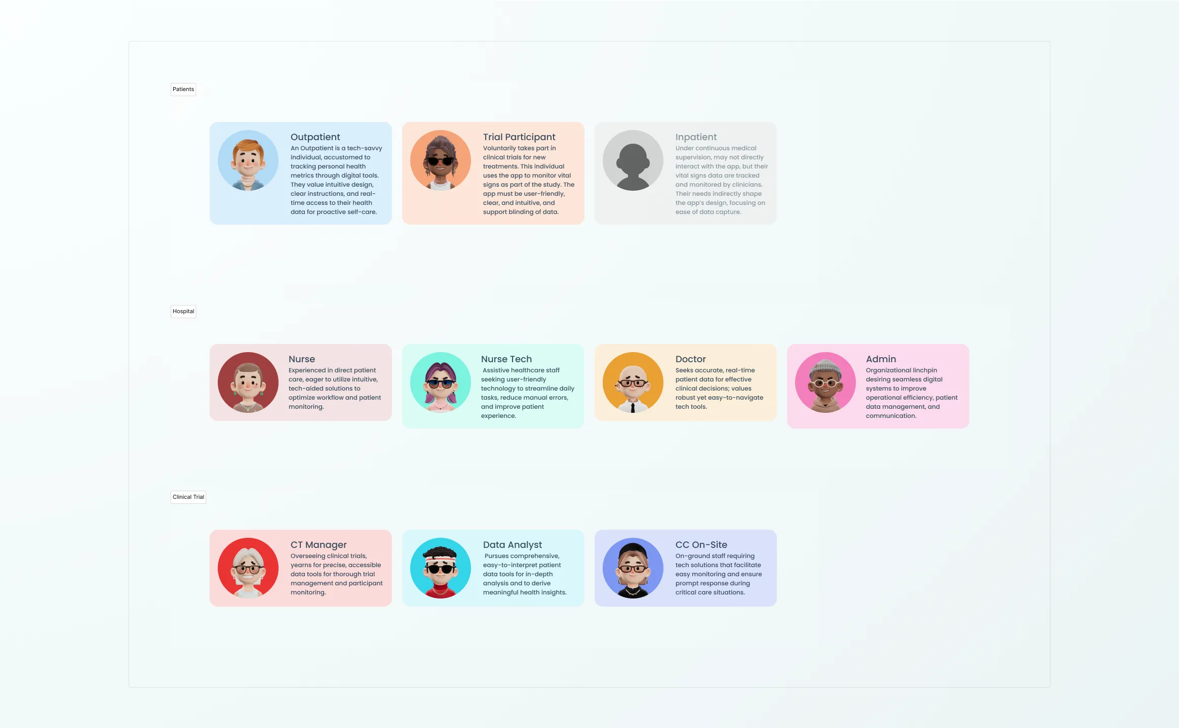
- Three primary user persona groups were created to align design efforts.
- The research aimed to understand the everyday workflow, identify pain points, and gauge satisfaction with the existing app.
- A final round of usability testing evaluated the redesigned interfaces.
- A total of 16 app sessions were conducted with a diverse participant pool of nurses, doctors, administrators, and outpatients.
- Findings from the research phase revealed issues in color accessibility, dashboard navigation, patch activation, alert notifications, and ambiguity in the onboarding flow.
Redesign Strategy
UX Cabin's redesign strategy relied on findings from user research, building an understanding of the existing applications, consideration of the wearable device's features, and careful consideration of the existing front-end frameworks.
- Mapping the different user flows of the existing Clinician and Patient apps.
- The UX Cabin team used these flows to build our understanding of the product and identify areas of opportunity with the client.
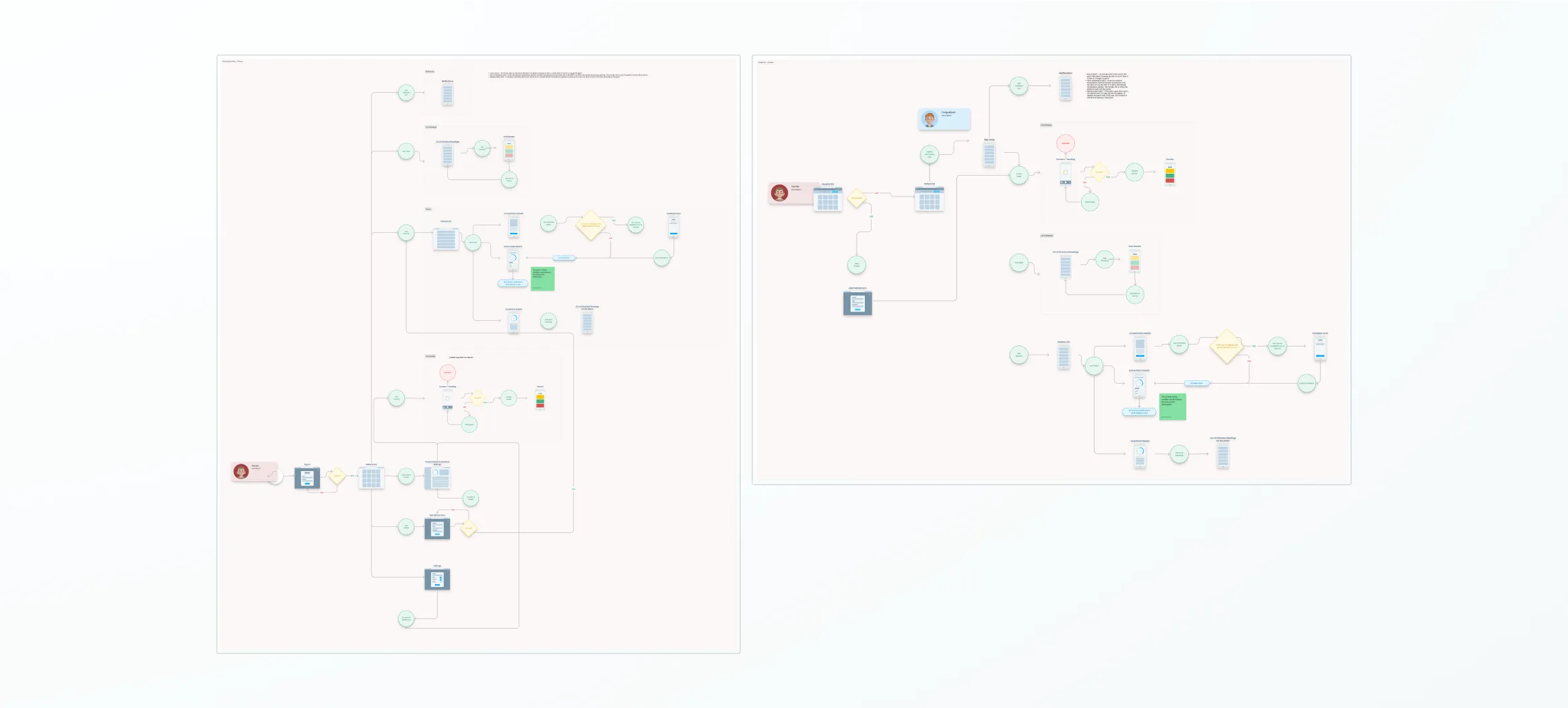
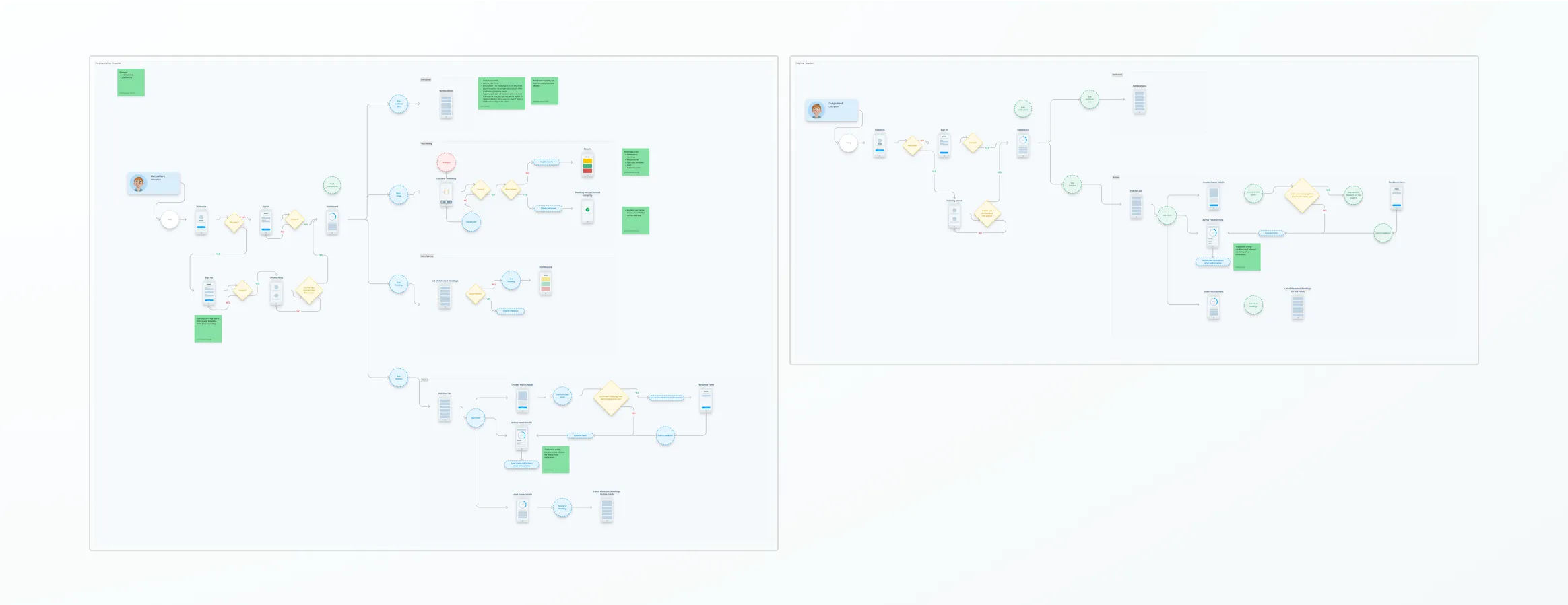
- We concentrated our redesign efforts on the web app built specifically for clinicians.
- The clinician app was used to monitor patient vital signs and understand patient trends for in-patient care and clinical trials.
- Early market research insights, such as including a dark mode theme for the UI, were incorporated into the redesign to ensure it aligned with user expectations.
Redesign: From Initial Concepts to Feature-Enriched Solutions
The redesign process transitioned the existing applications into improved, feature-rich versions guided by research insights, user needs, and technological compatibility.
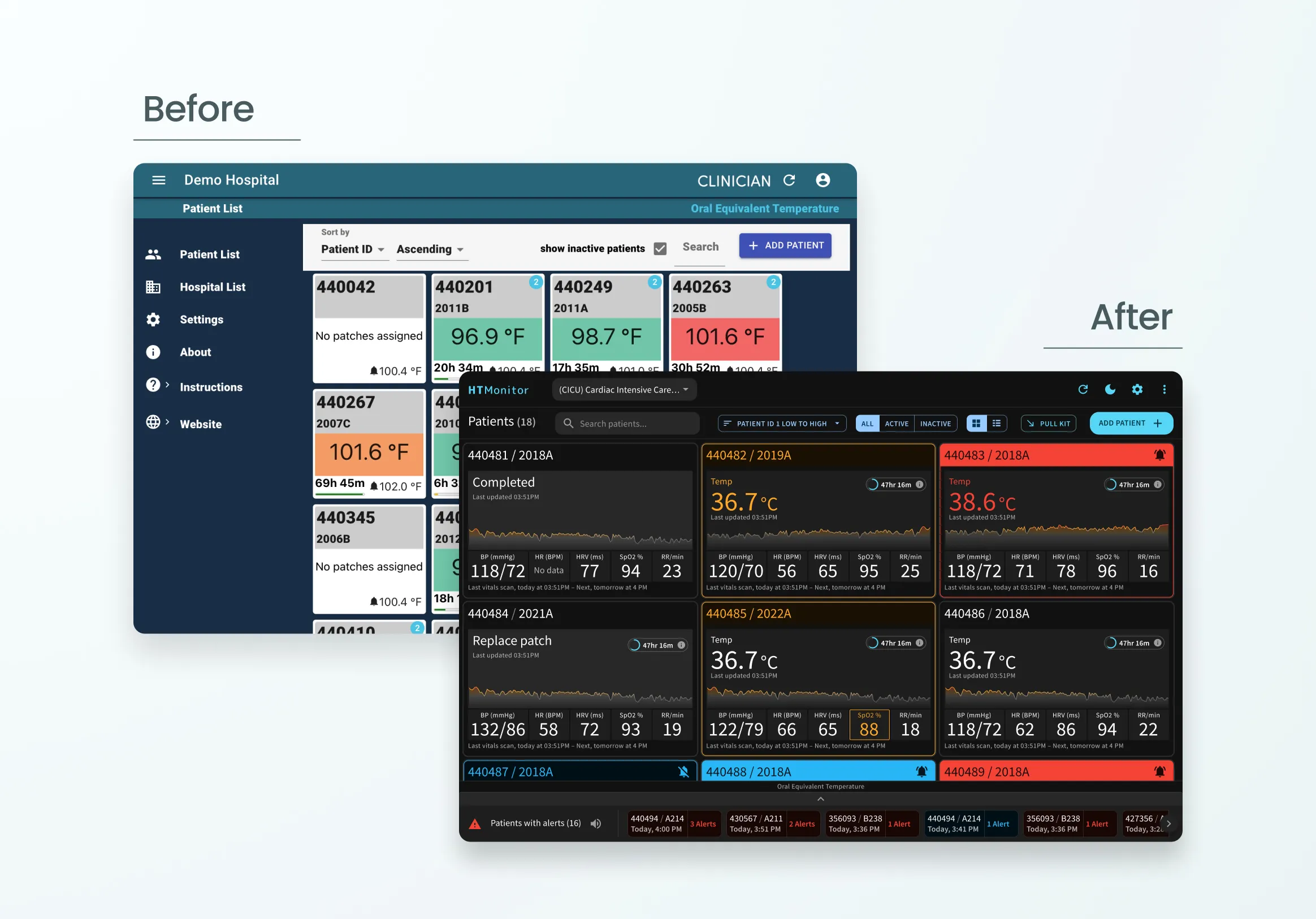
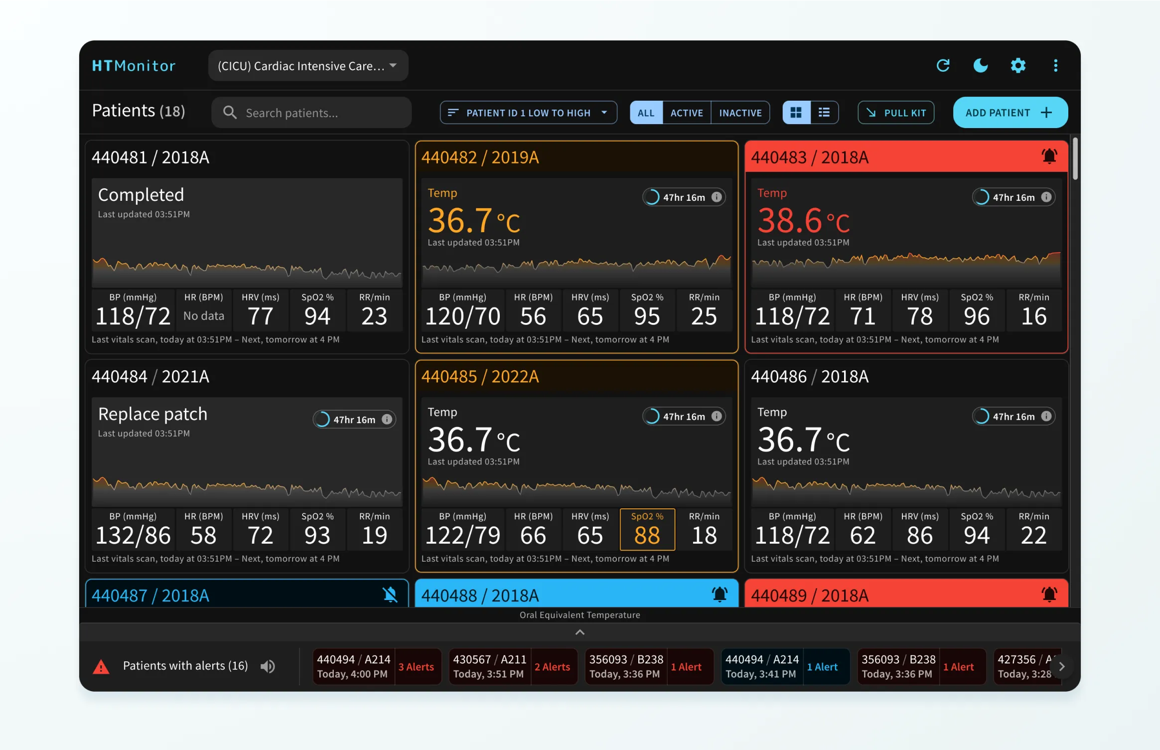
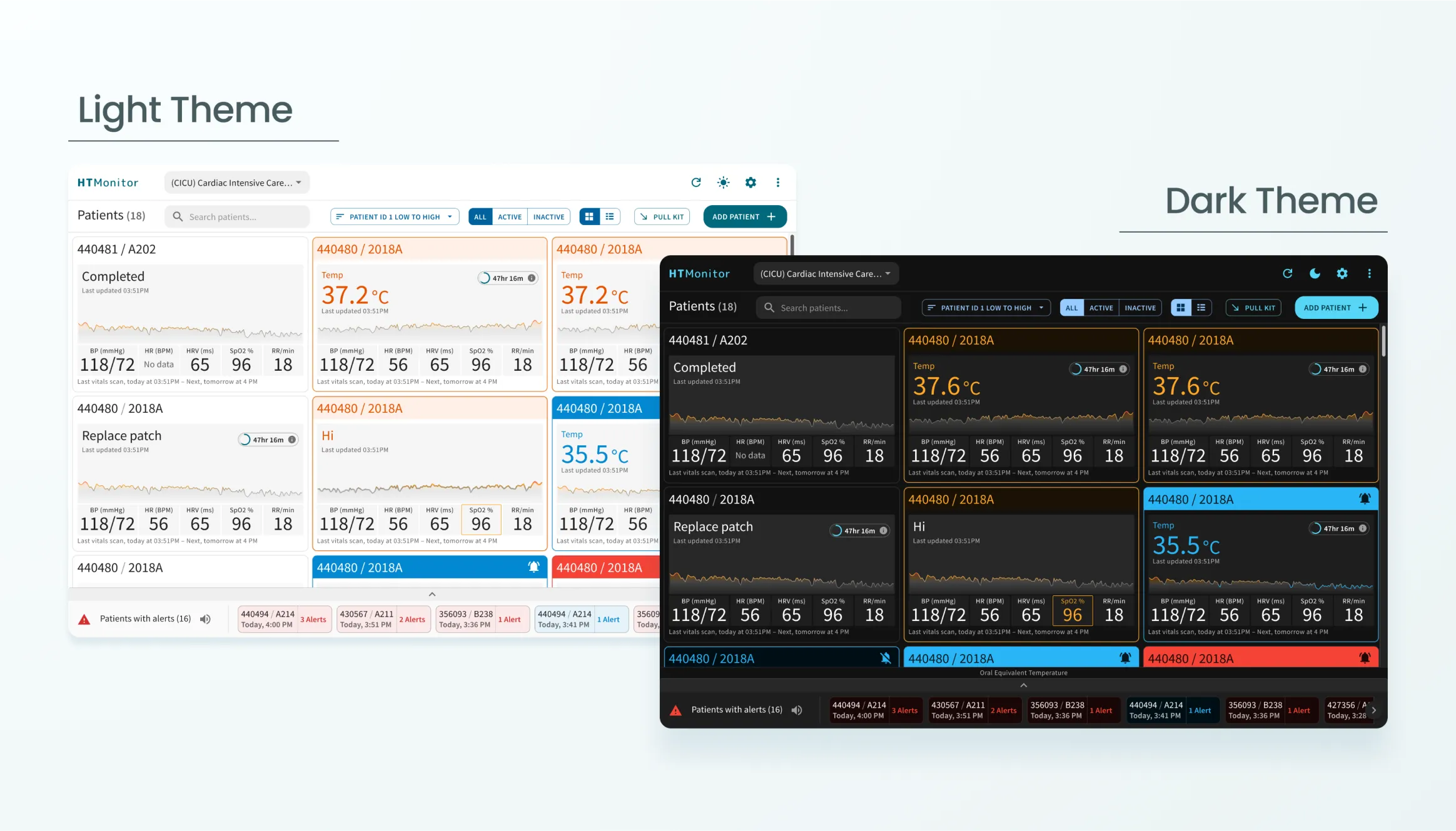
Research insights had a significant influence on design choices, leading to improvements in data presentation and visualization. An especially notable feature was the introduction of color-coded trend graphs in the patient list, which provided a quick overview of vital signs.
Clinician Web App - Patient Listing
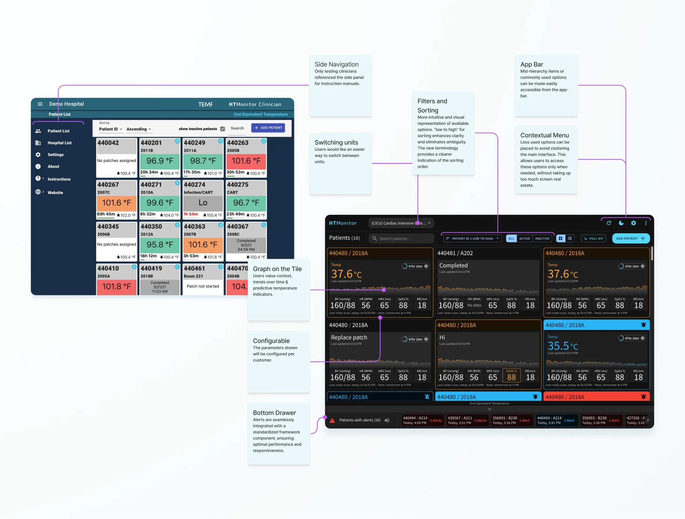
The clinician web application saw considerable enhancements, including a more streamlined and responsive interface that functioned smoothly across a range of devices. This included nursery monitors, laptops on carts, tablets, and mobile phones. A cleaner, more intuitive user experience was achieved by eliminating unnecessary side panel navigation and reorganizing items in the app bar.
Below is a comparison of the old patient listing with our new designs.
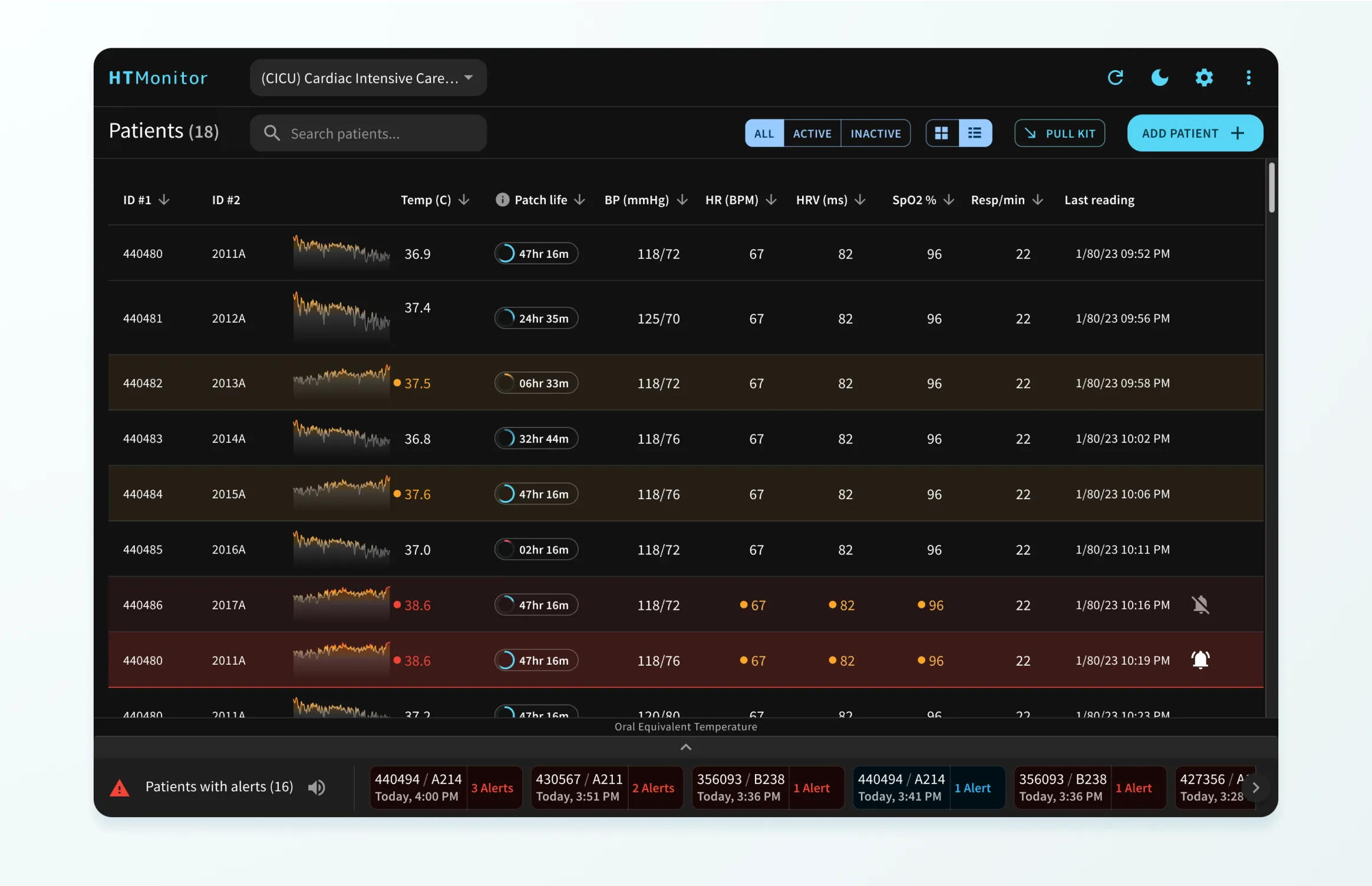
The patient listing had an alternate view where the clinician would be able to see a table listing of all active patients. This was especially useful in use cases where a clinician might be monitoring 8+ patients. Additionally, flexible sorting and filtering options enable clinicians to tailor their view according to parameters like severity or recent updates.
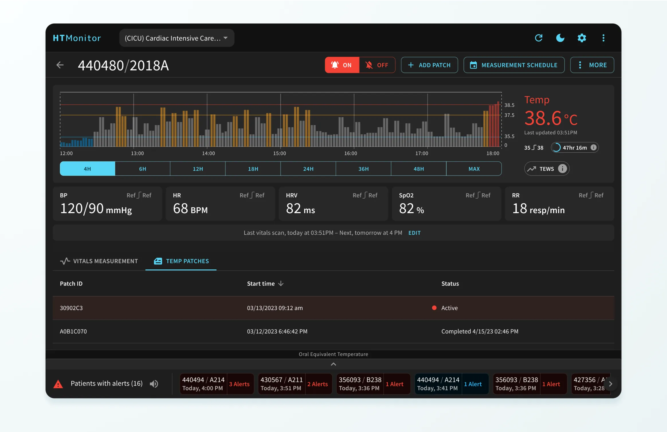
Clinician Web App - Patient Details
In the revamped patient details view, we introduced an adaptable layout accommodating various vitals. This flexibility caters to different use cases and guarantees a scalable design solution. The reimagined temperature chart now segments data into specific time spans, fostering precision in tracking and understanding temperature trends.
Clinician Web App - Light and Dark Themes
Our designs incorporated both dark and light themes, enabling users to select their preferences based on environmental factors and personal comfort. Given the 24/7 nature of hospital settings, the dark mode provides comfort during night shifts or in low-light situations, reducing eye strain and facilitating readability.
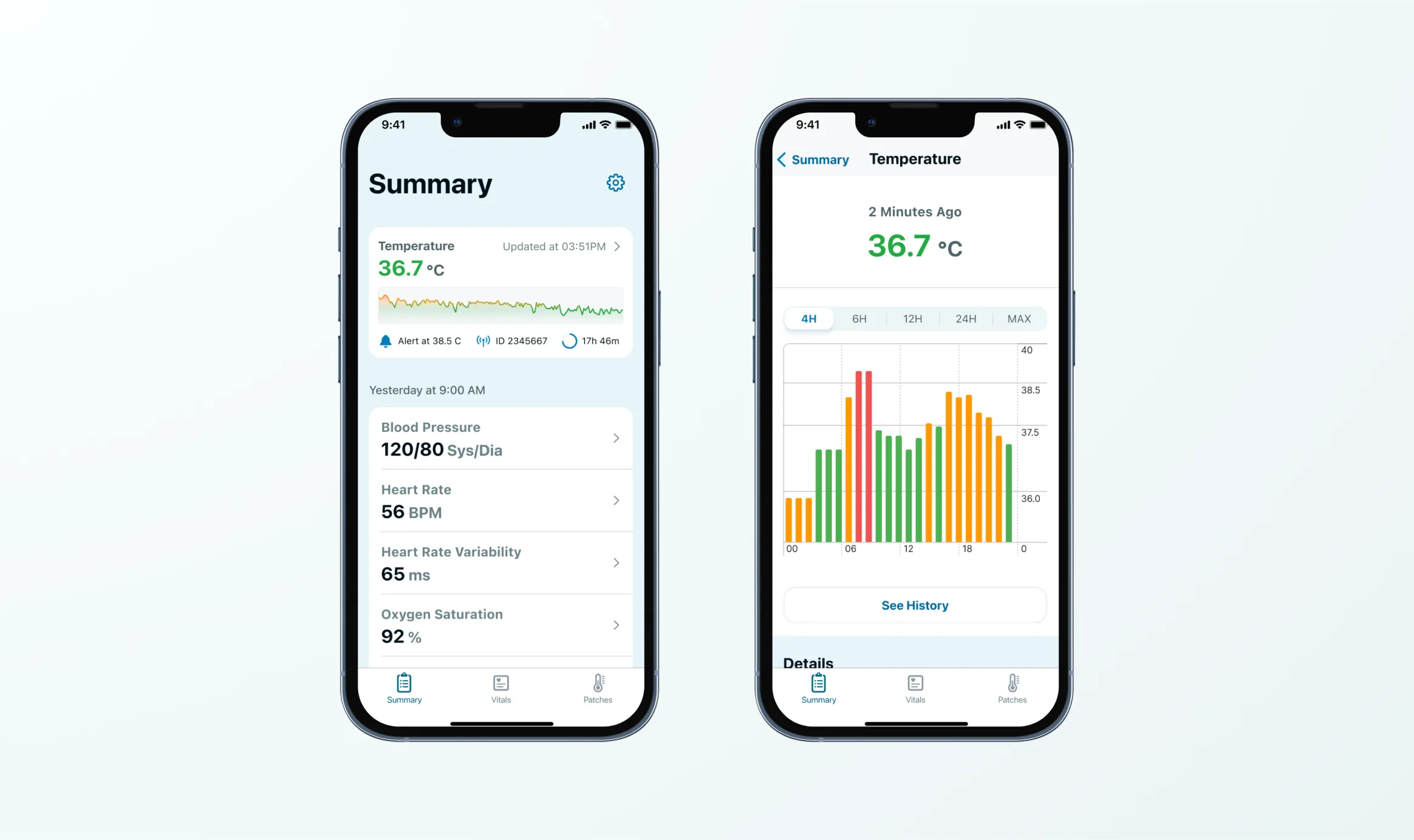
Outpatient Mobile App
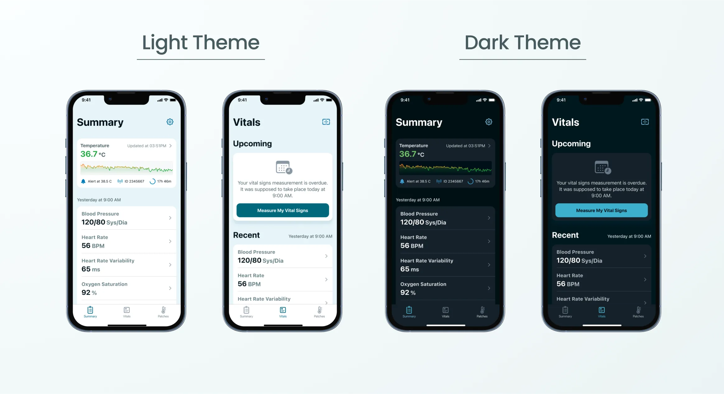
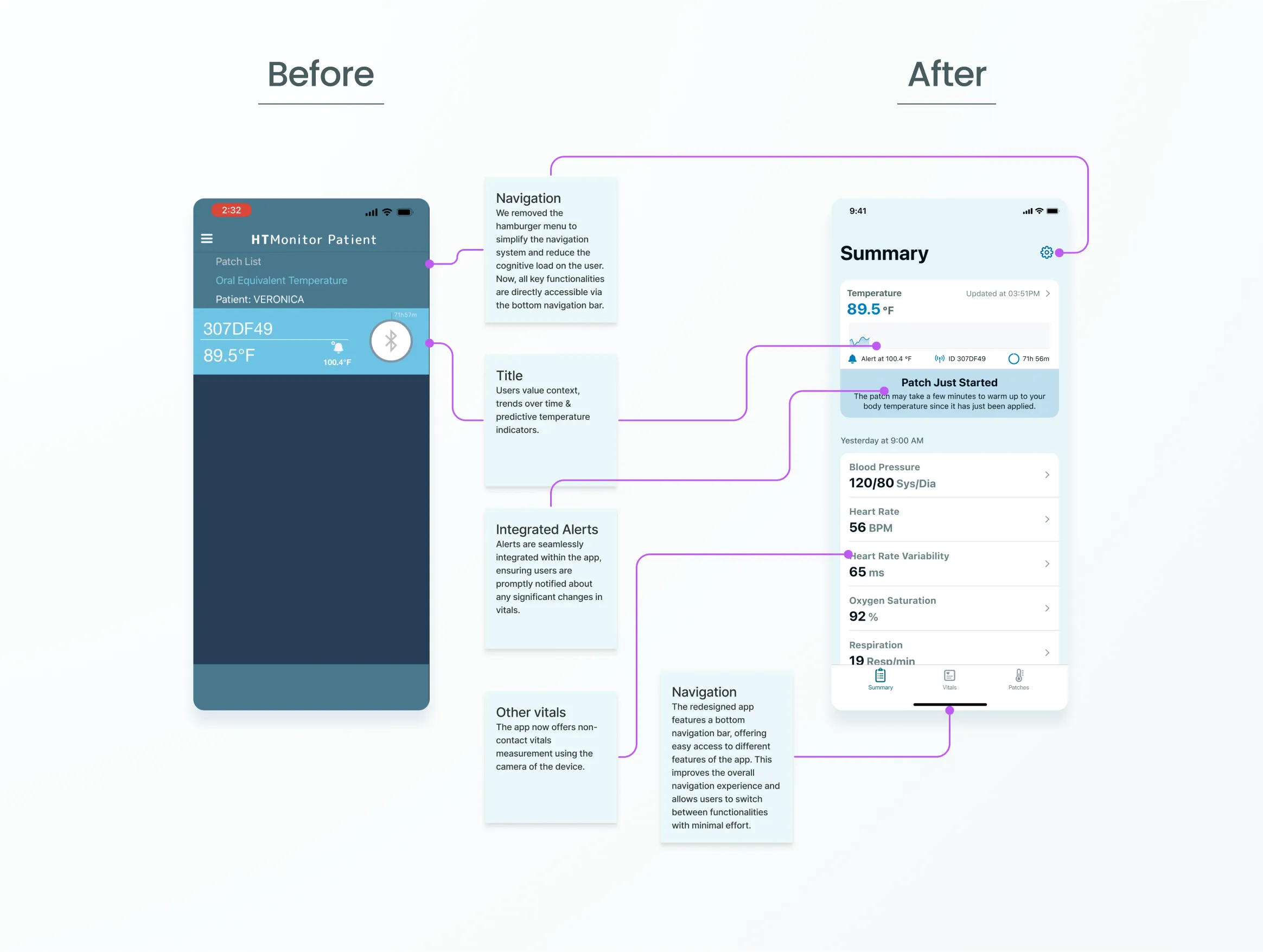
For the outpatient mobile applications, the self-monitoring experience was evolved through improved interactions between the user, the patch, and the app. This was achieved by refining the UI/UX design, improving the stepper process, and simplifying app navigation.
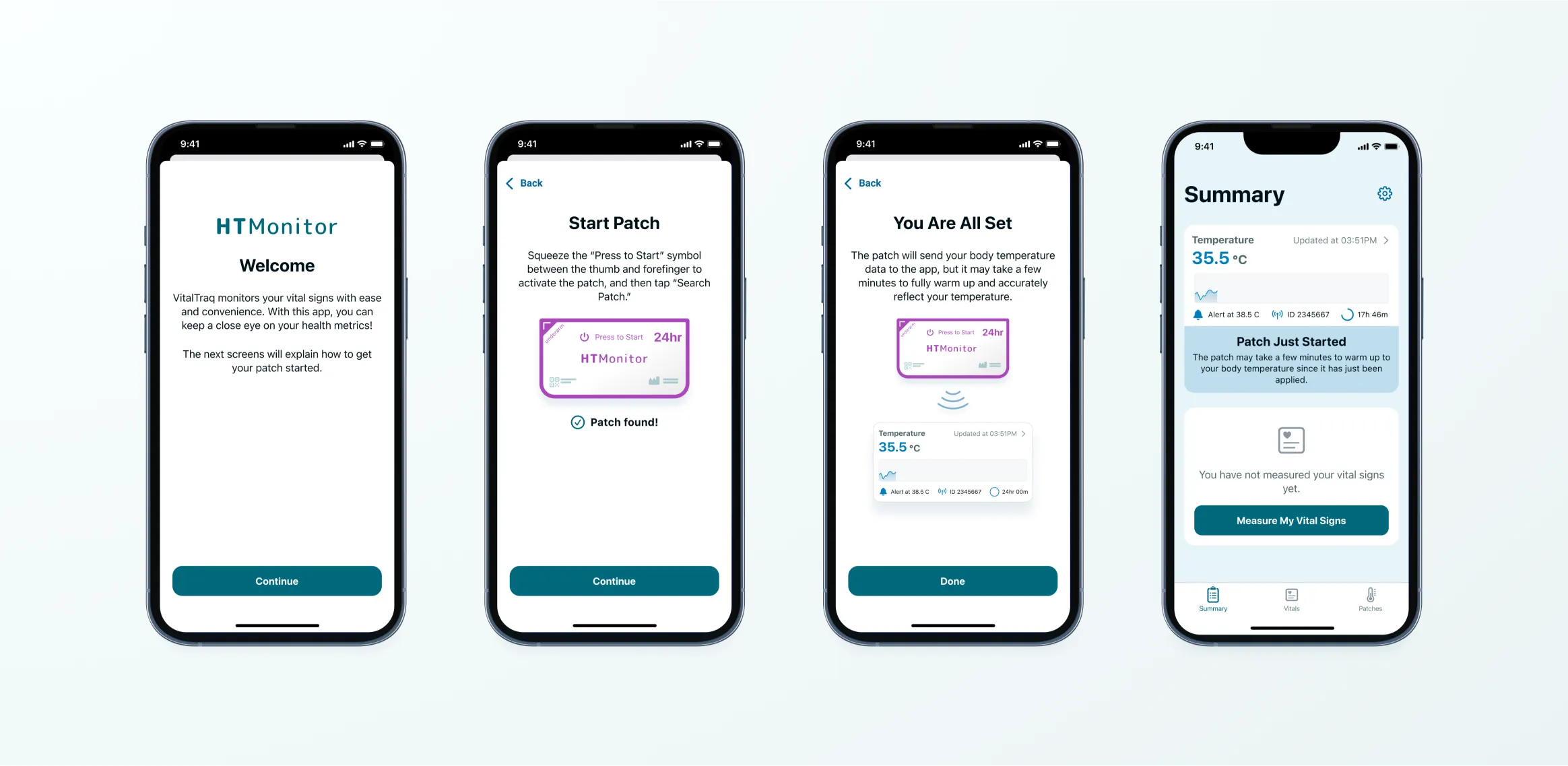
Outpatient Mobile App - Onboarding
We reworked the onboarding process for a more user-friendly experience. The new design breaks down the setup into manageable steps, with clear guidance, visuals, and real-time feedback fostering a positive first impression and seamless journey.
Outpatient Mobile App - New Features
We incorporated both light and dark themes in the redesigned outpatient apps, offering users an optimized experience regardless of their lighting environment or personal preference.
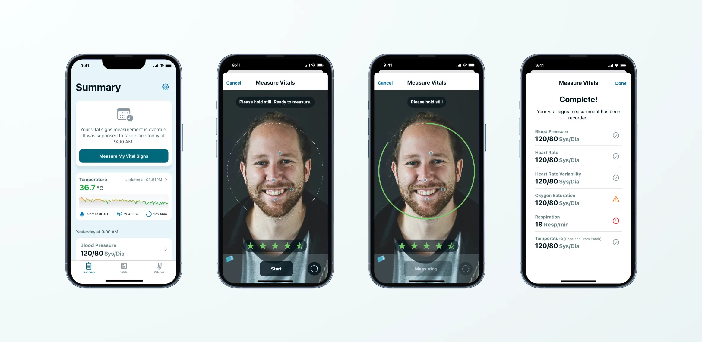
Below is a comparison of the transformation from the original patient application to our newly redesigned version.
Delivery and Handoff: Ensuring a Smooth Transition
The final stage of the project involved a meticulous process of design delivery and handoff, facilitating a seamless transition. The client's in-house development team were well-equipped to begin the implementation of the redesigned application.
Successful collaboration between our team and the client was crucial to the project. Regular meetings ensured open communication and alignment with the client's business goals, user needs, and technical constraints.
The iterative nature of this collaboration allowed for ongoing feedback and adjustments, ensuring the final designs truly met the project objectives.
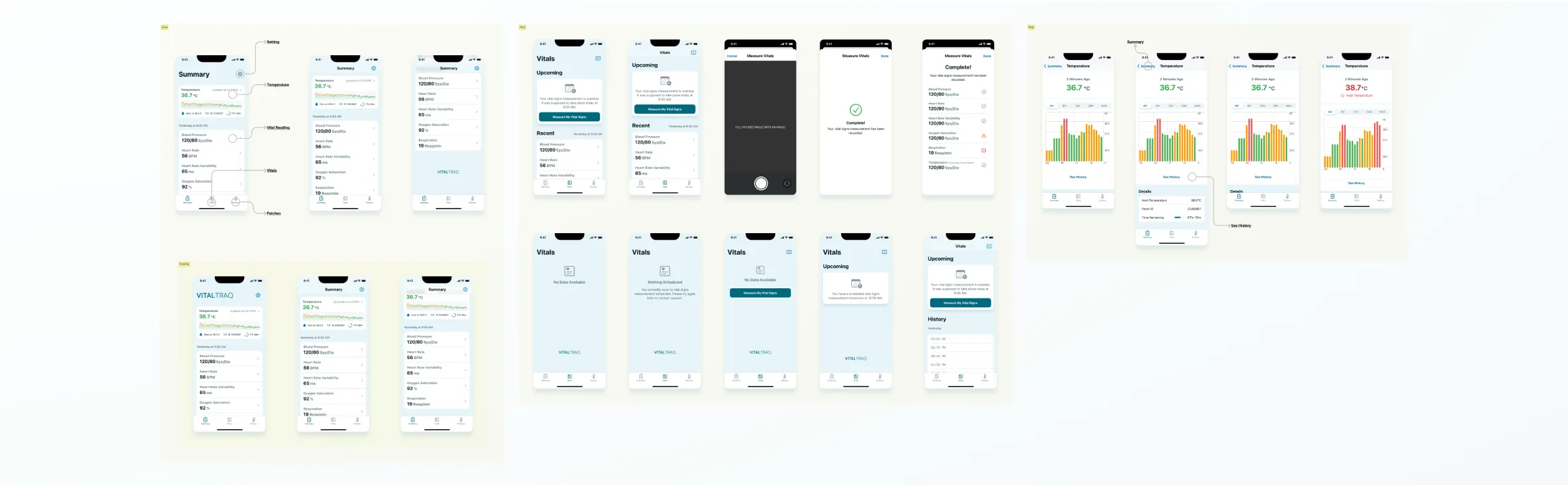
The final delivery included:
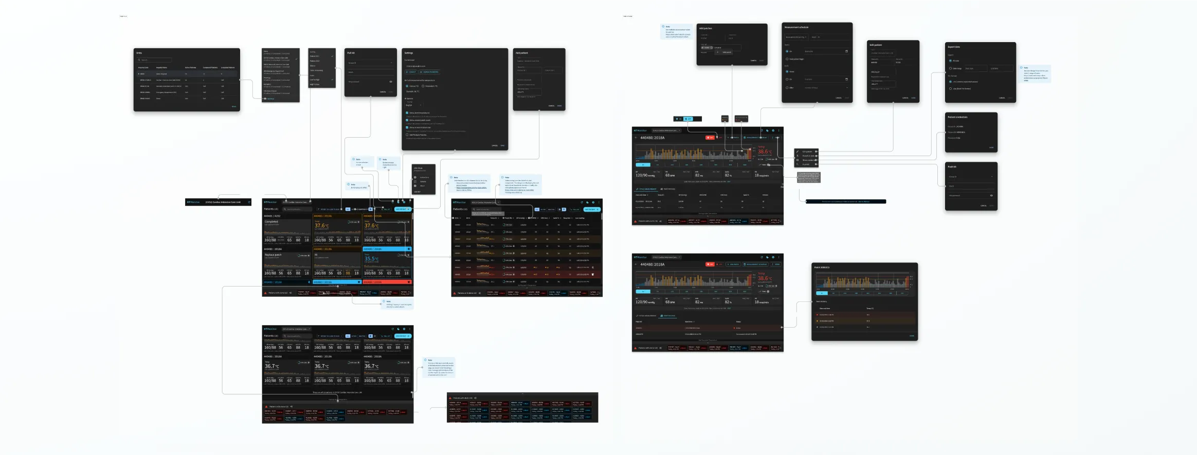
- Interactive prototypes for client review and testing.
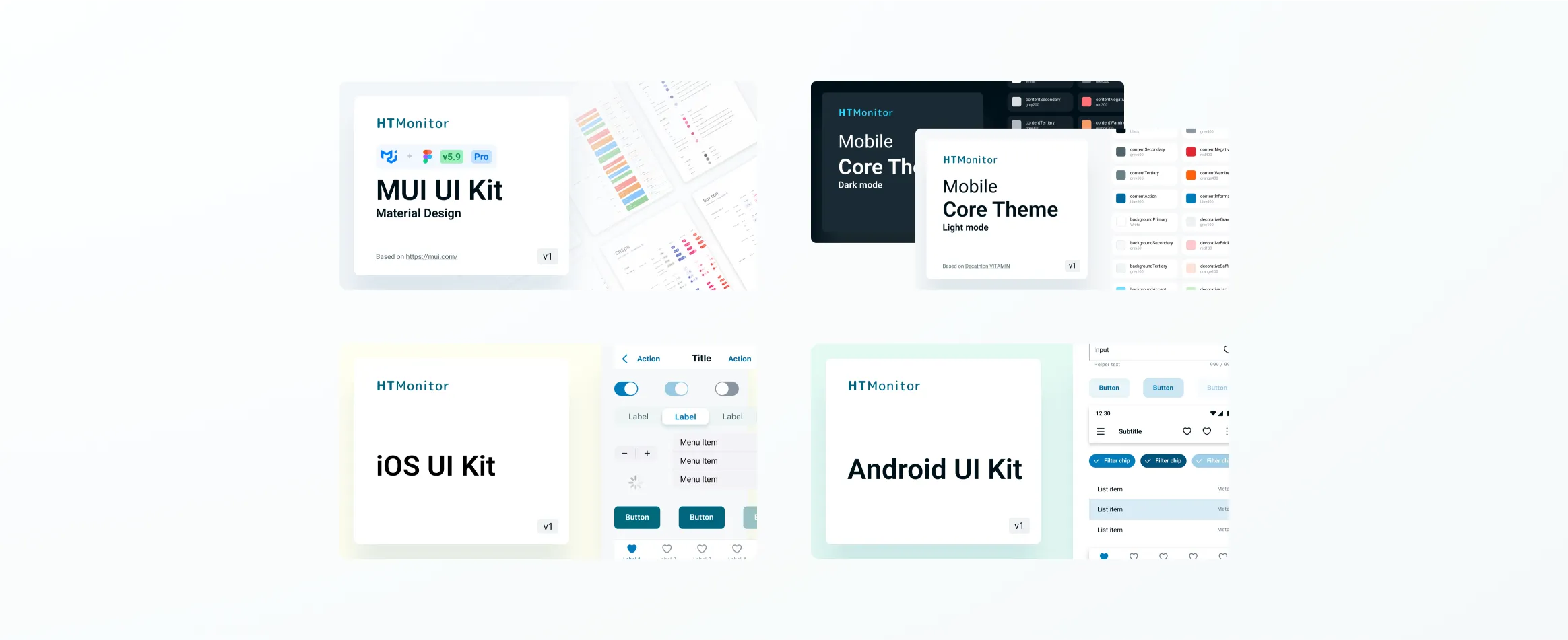
- All design files, UI kits, color definitions, font styles, and icon libraries through a collaborative design tool.
- A detailed document serving as a central reference point for all design resources and processes.
- A recorded video walkthrough of all key screens for both applications.
- A detailed overview of the design architecture, use of UI kits, and consistent color themes applied across platforms.
Conclusion
The redesign project embarked upon with our partner was an inspiring journey of transforming the digital platforms, underpinned by our shared commitment to usability, efficiency, and user-centric design.
Recap of the Redesign Project
Over a focused engagement, we successfully redesigned the applications, significantly improving their user-friendliness and functionality. We fast-tracked key features and ensured their efficient delivery, fundamentally transforming the user experience.
Achievements and Impact
Our collaborative efforts yielded significant improvements, notably in data visualization, intuitive navigation, and self-monitoring of vitals. The integration of novel features further enhanced the applications' usability, resulting in a far-reaching positive impact.
Reflecting on Collaboration
Throughout the project, the communication and collaboration remained highly efficient and effective. Design hand-offs were smoothly delivered using Figma, with supplementary Loom videos for any necessary walkthroughs.
In addition, a comprehensive handoff document was provided, serving as a valuable guide and reference for the partner's in-house teams. This iterative design and delivery process, fortified by open dialogue, became an essential driver of the project's success.